appendix C Graphics in base R
This appendix provides an alternative solution to the problem of visualizing data. There are many reasons why ggplot2 can be seen as a superior method of visualizing data, not least of which is the sophisticated application of the “grammar of graphics” philosophy. That’s not to say that what you’re about to see is useless, but as you learn more about ggplot2, you’ll have fewer and fewer reasons to ever use these functions.
The simplest way to generate a base plot is to call plot() with vectors of x and y data, as in figure C.1:
plot(x = mtcars$disp, y = mtcars$mpg)
You’ll notice a few major differences in how this is written and what is produced. First, since you’re passing vectors (not bare names of columns), you have the dataset explicitly in each argument. The plot shows these argument names as the x- and y-axis labels (similar to how ggplot() did). This isn’t strictly necessary; you could save those to their own variables just the same:
disp_data <- mtcars$disp
mpg_data <- mtcars$mpg

head(mpg_data)
#> [1] 21.0 21.0 22.8 21.4 18.7 18.1
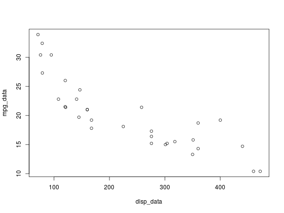
And you could use these objects as the arguments (see figure C.2):
plot(x = disp_data, y = mpg_data)
The axis labels now reflect the names of the arguments.
Figure C.1 A simple base plot
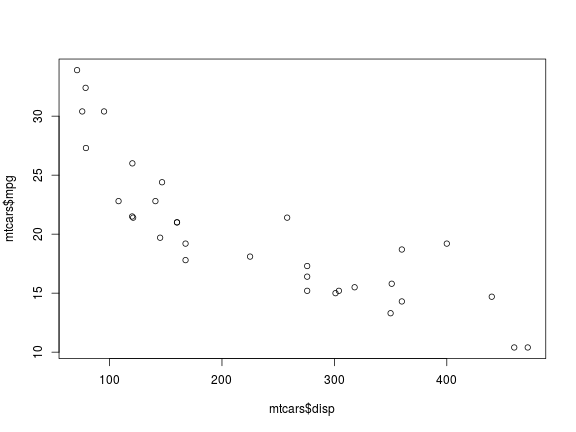
Figure C.2 Using variables as x and y arguments