This chapter covers
- Manipulating elements using transforms for performant transitions and animations
- Adding a “bounce” effect to a transition
- The browser’s rendering pipeline
- Looking at 3D transforms and perspective
In this chapter, we’ll explore the transform property, which you can use to change or distort the shape or position of an element on the page. This can involve rotating, scaling, or skewing the element in two or three dimensions. Transforms are most commonly used in conjunction with transitions or animations, which is why I’ve sandwiched this chapter between those two topics. In these last two chapters, you’ll build a page that makes heavy use of transitions, transforms, and animations.
First, I’ll walk you through applying transforms to a static element. This’ll give you a grasp on how they work in isolation before we add them into some transitions. Then you’ll build a small but complex menu with multiple transforms and transition effects. Finally, we’ll take a look at working in 3D and utilizing perspective. This will carry over into the next chapter, where we’ll use 3D transforms in conjunction with animation.
transform: rotate(90deg);
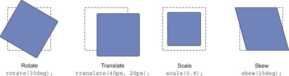
This rule, when applied to an element, rotates it 90 degrees to the right (clockwise). The transform function rotate() specifies how the element is to be transformed. You’ll find several other transform functions, but they generally all fall into one of four categories (illustrated in figure 15.1).
- Rotate—Spins the element a certain number of degrees around an axis
- Translate—Moves the element left, right, up, or down (similar to relative positioning)
- Scale—Shrinks or expands the element
- Skew—Distorts the shape of the element, sliding its top edge in one direction and its bottom edge in the opposite direction
Figure 15.1. The four basic types of transform (a dashed line represents the initial elements’ positions)
Each transform is applied using the corresponding function as a value of the transform property. Let’s create a simple example to try these out in your browser. This’ll be a card with an image and text (figure 15.2), which you can apply transforms to.

Create a new page and stylesheet and link them. Add the HTML shown here.
Listing 15.1. Creating a simple card
<div class="card">
  <img src="images/chicken1.jpg" alt="a chicken"/>
  <h4>Mrs. Featherstone</h4>
  <p> She may be a bit frumpy, but Mrs Featherstone gets the job done. She
     lays her largish cream-colored eggs on a daily basis. She is gregarious
     to a fault.</p>
  <p>This Austra White is our most prolific producer.</p>
</div>
Next, in the stylesheet, add the CSS in the following listing. This includes a few base styles, colors, and a card with a rotation transform applied.
Listing 15.2. Styling a card and applying a transform
body {
  background-color: hsl(210, 80%, 20%);
  font-family: Helvetica, Arial, sans-serif;
}

img {
  max-width: 100%;
}

.card {
  padding: 0.5em;
  margin: 0 auto;                 #1
  background-color: white;
  max-width: 300px;
  transform: rotate(15deg);       #2
}
Load this into your browser and you’ll see the card rotated. Experiment with this a bit to get a feel for how the rotate() function behaves. Use a negative angle to rotate the card left (for example, try rotate(-30deg)).
Next, try changing the transform to some of the other functions. Use the following values and observe how they each behave:
- skew(20deg)—Skews the card 20 degrees. Try a negative angle to skew in the other direction.
- scale(0.5)—Shrinks the card to half of its initial size. The scale() function takes a unitless number. Values less than 1 shrink the element; values greater than 1 expand it.
- translate(20px, 40px)—Shifts the element 20 pixels right and 40 pixels down. Again, you can use negative values to transform in the opposite direction.
One thing to note when using transforms is that, while the element may be moving to a new position on the page, it doesn’t shift the document flow. You can translate an element all the way across the screen, but its original location remains unoccupied by other elements. Also, when rotating an element, a corner of it may shift off the edge of the screen. Similarly, it could potentially cover up portions of another element beside it (figure 15.3).

In some cases, I find it’s helpful to set plenty of margin for one or both of the elements to prevent unwanted overlapping.
Warning
Transforms cannot be applied to inline elements like <span> or <a>. To transform such an element, you must either change the display property to something other than inline (such as inline-block) or change the element to a flex or grid item (apply display: flex or display: grid to the parent element).
A transform is made around a point of origin. This point serves as the axis of rotation, or the spot where scaling or skewing begins. This means the origin point of the element remains locked in place, while the rest of the element transforms around it (though this doesn’t apply to translate() as the whole element moves during a translation).
By default, the point of origin is the center of the element, but you can change this with the transform-origin property. Figure 15.4 shows some elements transformed around different points of origin.
Figure 15.4. Rotate, scale, and skew made with the transform origin at various corners of the element.
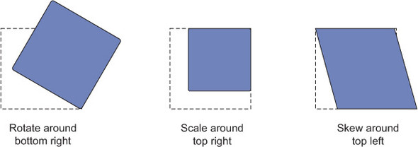
For the element on the left, the rotation pivots about the origin, which is set using transform-origin: right bottom. The element in the middle scales toward the origin (right top). And the element on the right skews in such a way that its origin (left top) remains in place while the rest of the element stretches away.
The origin can also be specified in percentages, measured from the top left of the element. The following two declarations are equivalent:
transform-origin: right center;
transform-origin: 100% 50%;
Note
You can also use a length to specify the origin in pixels, ems, or another unit. Though, in my experience, the keywords top, right, bottom, left, and center are all you’ll need in most instances.
You can specify multiple values for the transform property, each separated by a space. Each transform value is applied in succession from right to left. If you apply transform: rotate(15deg) translate(15px, 0), the element is translated 15 px to the right, then rotated 15 degrees clockwise. Edit your stylesheet to work with this a bit.
Listing 15.3. Applying multiple transforms
.card {
  padding: 0.5em;
  margin: 0 auto;
  background-color: white;
  max-width: 300px;
  transform: rotate(15deg) translate(20px, 0);          #1
}
It’s probably easiest to see this effect if you open your browser’s DevTools and manipulate the values live to see how they affect the element. Notice that changing the values for translate() seems to move the element along a diagonal axis, rather than the normal cardinal directions; this is because the rotation takes place after the translation.
This can be a little tricky to work with. I generally find it’s easier to do translate() manipulations last chronologically (first in source order for transform), so I can work with the normal left/right, up/down coordinates. To see this, reverse the order to transform: translate(20px, 0) rotate(15deg).
Transforms by themselves aren’t all that practical. A box with a skew() applied may look interesting, but it’s not exactly easy to read. But when used in conjunction with motion, transforms become much more useful.
Let’s build a page that makes use of this concept. A screenshot of the page you’ll make is shown in figure 15.5. You’ll be adding a lot of motion to this page.

In this section, you’ll build the navigational (nav) menu on the left. Initially, it appears as just four icons stacked vertically, but, upon hover, the text for the menu appears. This example will include several transitions and a couple transforms. Let’s get the page set up, then we’ll take a closer look at the nav menu. (In the next chapter, you’ll build the main cards section in the center and add more transforms and some animation to it.)
Create a new page and a new stylesheet named style.css and add the following markup. This markup includes a link to two web fonts (Alfa Slab One and Raleway) from the Google Fonts API. It also has the markup for the page header and the nav menu.
Listing 15.4. Page markup for transforms in motion
<!doctype html>
<html lang="en">
  <head>
    <title>The Yolk Factory</title>
    <link
     href="https://fonts.googleapis.com/css?family=Alfa+Slab+One|Raleway"
     rel="stylesheet">                                                 #1
    <link rel="stylesheet" href="style.css">
  </head>

  <body>
    <header>
      <h1 class="page-header">The Yolk Factory</h1>
    </header>
    <nav class="main-nav">
      <ul class="nav-links">
        <li>
          <a href="/">
            <img src="images/home.svg" class="nav-links__icon"/>      #2
            <span class="nav-links__label">Home</span>                #2
          </a>
        </li>
        <li>
          <a href="/events">
            <img src="images/calendar.svg" class="nav-links__icon"/>  #2
            <span class="nav-links__label">Events</span>              #2
          </a>
        </li>
        <li>
          <a href="/members">
            <img src="images/members.svg" class="nav-links__icon"/>   #2
            <span class="nav-links__label">Members</span>             #2
          </a>
        </li>
        <li>
          <a href="/about">
            <img src="images/star.svg" class="nav-links__icon"/>      #2
            <span class="nav-links__label">About</span>               #2
          </a>
        </li>
      </ul>
    </nav>
  </body>
</html>
The nav element contains the largest part of this markup. It includes an unordered list (<ul>) of links. Each link consists of an icon image and a text label. Notice that the icon images here are in SVG format. This’ll become important later on. You’ll add more content to the page when you’re ready to style it in the next chapter.

SVG—Short for Scalable Vector Graphics. This is an XML-based image format that defines an image using vectors. Because the image is mathematically defined, it can scale up and down to any size. SVG is broadly supported in all browsers.
Next, you’ll add some base styles, including a background gradient and padding around the main heading. You’ll also apply the web fonts to the page. Copy or add the following listing into your stylesheet. These are just the base styles and page-header; you’ll work on laying out the menu next.
Listing 15.5. Base styles and heading
html {
  box-sizing: border-box;
}
*,
*::before,
*::after {
  box-sizing: inherit;
}

body {
  background-color: background-color: hsl(200, 80%, 30%);
  background-image: radial-gradient(hsl(200, 80%, 30%),     #1
                      hsl(210, 80%, 20%));                  #1
  color: white;
  font-family: Raleway, Helvetica, Arial, sans-serif;
  line-height: 1.4;
  margin: 0;
  min-height: 100vh;                                        #2
}

h1, h2, h3 {
  font-family: Alfa Slab One, serif;
  font-weight: 400;
}

main {
  display: block;
}

img {
  max-width: 100%;
}

.page-header {
  margin: 0;
  padding: 1rem;                                            #3
}
@media (min-width: 30em) {                                  #4
  .page-header {                                            #4
    padding: 2rem 2rem 3rem;                                #4
  }                                                         #4
}                                                           #4
This example uses a number of concepts from earlier chapters. I’ve used a radial gradient for the body background. This adds a nice bit of depth to the page. (The background-color provides a fallback value for Opera Mini, which doesn’t support radial gradients.) The web font Alfa Slab One is applied to the headings and Raleway to the body copy. I’ve also provided responsive styles for the page header using a media query, adding a larger padding when the screen size can afford it.
We’ll take the menu in several stages. First, let’s get the menu laid out and then provide some responsive behavior. You’ll do this with a mobile first approach (chapter 8), so let’s start with the small viewport. The heading and menu should look like figure 15.6.

Because you want to lay out the navigational links horizontally for smaller viewports, an approach using a flexbox makes sense. You can evenly space the navigational items across the width of the page by applying align-content: space-between to the flex container. Next, you’ll set font colors and align the icons. Add the following listing to your stylesheet.
Listing 15.6. Mobile styles for the nav menu links
.nav-links {
  display: flex;                    #1
  justify-content: space-between;   #1
  margin-top: 0;
  margin-bottom: 1rem;
  padding: 0 1rem;
  list-style: none;
}
.nav-links > li + li {
  margin-left: 0.8em;
}
.nav-links > li > a {
  display: block;
  padding: 0.8em 0;
  color: white;
  font-size: 0.8rem;
  text-decoration: none;            #2
  text-transform: uppercase;        #2
  letter-spacing: 0.06em;           #2
}
.nav-links__icon {
  height: 1.5em;
  width: 1.5em;
  vertical-align: -0.2em;           #3
}
.nav-links > li > a:hover {
  color: hsl(40, 100%, 70%);
}
You’ll keep the menu like this on smaller viewports. But on larger screens, you can layer on more effects. For the desktop layout, you’ll dock it to the left-hand side of the screen using fixed positioning. This’ll look like figure 15.7.

This menu is built from two modules: I’ve named the outer element main-nav and the inner structure nav-links. The main-nav serves as the container, which you’ll position to the left. The main-nav also provides the dark background. Let’s get this into place.
Add the next listing to your stylesheet; make sure the second media query and its contents are placed after the existing main-nav styles so they can override the mobile styles where necessary.
Listing 15.7. Positioning the menu for large viewports
@media (min-width: 30em) {                      #1
  .main-nav {
    position: fixed;
    top: 8.25rem;
    left: 0;
    z-index: 10;                                #2
    background-color: transparent;              #3
    transition: background-color .5s linear;    #4
    border-top-right-radius: 0.5em;
    border-bottom-right-radius: 0.5em;
  }

  .main-nav:hover {
    background-color: rgba(0, 0, 0, 0.6);       #5
  }
}

/* ... */

@media (min-width: 30em) {                      #6
  .nav-links {
    display: block;
    padding: 1em;
    margin-bottom: 0;
  }
  .nav-links > li + li {
    margin-left: 0;
  }
  .nav-links__label {
    margin-left: 1em;
  }
}
The position: fixed declaration puts the menu into place and keeps it there, even as the page scrolls. The display: block rule overrides the display: flex from the mobile styles, causing the menu items to stack atop one another.
Now let’s start layering in some transition and transform effects. For that, you’ll do three things:
- Scale up the icon size while a link is hovered.
- Hide the link labels, then make them all appear with a fade-in transition when the user hovers over the menu.
- Use a translate to add a “fly in” effect to the link label in conjunction with the fade-in.
Let’s take these in each in turn.
Look at the structure of the navigational links. Each list item contains a link (<a>), which in turn contains an icon and a label:
<li>
  <a href="/">
    <img src="images/home.svg" class="nav-links__icon"/>
    <span class="nav-links__label">Home</span>
  </a>
</li>
Note
The list items, in conjunction with the parent <ul>, is a much larger, more deeply nested module than I prefer to make. I’d typically look for a way to split it up into smaller modules, but we’ll need to keep it all together in order to achieve some of these effects.
First, let’s scale up the icon on hover. You’ll do this with a scale transform, then apply a transition to it so the change happens seamlessly. In figure 15.8, the Events menu item is moused over, and its calendar icon is scaled up slightly.

The Events image has a set height and width, so you could make it larger by increasing these properties. But, this would cause some other elements to move around as the document flow would get recalculated.
By using a transform instead, the elements around it aren’t affected, and the Events label doesn’t shift to the right. Update your CSS to add this effect when the element is either hovered or focused.
Listing 15.8. Scaling up the icon when its link is hovered or focused
@media (min-width: 30em) {

  .nav-links {
    display: block;
    padding: 1em;
    margin-bottom: 0;
  }
  .nav-links > li + li {
    margin-left: 0;
  }
  .nav-links__label {
    margin-left: 1em;
  }

  .nav-links__icon {
    transition: transform 0.2s ease-out;     #1
  }

  .nav-links a:hover > .nav-links__icon,
  .nav-links a:focus > .nav-links__icon {
    transform: scale(1.3);                   #2
  }
}
Now, as you swipe your mouse across the menu items, you’ll see the icons grow a bit to help indicate which item you’re hovering over. I intentionally chose to use SVG image assets here, so there’s no pixelation or other odd distortions when the image size changes. The scale() transform is a perfect way to do this.
SVG: a better approach to icons
Icons are an important part of some designs. The techniques used for icons have evolved and, for a long time, the best practice was to put all your icons into a single image file, called a sprite sheet. Then—using a CSS background image and some careful sizing and background positioning—display one icon from the sprite sheet in an element.
Next, icon fonts became popular. Instead of embedding sprites in an image, this approach involves embedding each icon as a character in a custom-made font file. Using web fonts, a single character would render as an icon. Services like Font-Awesome (http://fontawesome.io/) provide hundreds of general-use icons to make this easy.
These techniques still work, but I encourage you to make the switch to SVG icons. SVG is much more versatile and more performant. You can use an SVG as an <img> source, as you’ve done in this chapter, but SVG provides other options as well. You can create an SVG sprite sheet, or because SVG is an XML-based file format, you can inline it directly in your HTML. For example:
This allows you to target parts of the SVG directly from CSS if you want; you can dynamically change the colors—or even the size and position—of various parts of an SVG, using regular CSS. Yet the file sizes are smaller, and the images don’t pixelate like GIF, PNG, or other raster-based image formats.
If you’re not familiar with SVG, see https://css-tricks.com/using-svg/ for a good primer on the various ways you can use SVG in your web pages.
Now that the icons are looking great, let’s turn our attention to the labels beside them.
The menu labels don’t necessarily need to be visible at all times. You can hide them by default, leaving the icons in place to indicate to the user that the menu is there. Then, when the user moves their mouse over the menu or tabs to a menu item, you can fade in the labels. This way, when the user mouses near the icons, the entire menu appears, using a number of effects all at once: the background and the labels will fade in, with the labels starting a little to the left of their final position (figure 15.9).

This effect requires two separate transitions on the labels at the same time: one for opacity and another for a translate() transform. Update this portion of your stylesheet, making the changes indicated in the following listing.
Listing 15.9. Transitioning in the nav-item labels
@media (min-width: 30em) {
  .nav-links {
    display: block;
    padding: 1em;
    margin-bottom: 0;
  }
  .nav-links > li + li {
    margin-left: 0;
  }

  .nav-links__label {
    display: inline-block;                                        #1
    margin-left: 1em;
    padding-right: 1em;
    opacity: 0;                                                   #2
    transform: translate(-1em);                                   #3
    transition: transform 0.4s cubic-bezier(0.2, 0.9, 0.3, 1.3),  #4
                opacity 0.4s linear;                              #4
  }
  .nav-links:hover .nav-links__label,                             #5
  .nav-links a:focus > .nav-links__label {                        #5
    opacity: 1;                                                   #5
    transform: translate(0);                                      #5
  }

  .nav-links__icon {
    transition: transform 0.2s ease-out;
  }
  .nav-links a:hover > .nav-links__icon,
  .nav-links a:focus > .nav-links__icon {
    transform: scale(1.3);
  }
}
This menu occupies a small portion of the screen’s real estate, but there’s a lot going on. Some of these selectors are fairly long and complicated.
Notice how the :hover pseudo-class you just added is on the top-level nav-links element, while the :focus pseudo-class is on the <a> within. (Focus generally can only apply to certain elements like links and buttons.) This way, the labels all appear as soon as the menu is moused over. Additionally, an individual label also appears if the user focuses it using the Tab key on the keyboard.
When hidden, the label is shifted 1 em to the left using translate(). Then, as it fades in, it transitions back to its actual position. I’ve omitted the second parameter to the translate() function here and specified only the x value, which controls horizontal translation. Because you don’t need to translate the element up and down, this is fine.
The custom cubic-bezier() function is worth looking at as well. This produces a bounce effect: the label moves right beyond the ending location before settling back where it stops. This curve is illustrated in figure 15.10.

Notice that the curve extends outside the top of the box, meaning the value exceeds the value at the end of the transition. In transition from a translate(-1em) to translate(0), the label’s transform will momentarily reach a value about 0.15 em beyond the final position before easing back. You can also similarly create a bounce at the beginning of the timing function by moving the first control handle below the bottom of the box. You cannot, however, extend outside the left and right edges as this would produce an illogical transition curve.
Load the page in your browser and watch how this transition behaves. The bounce is subtle, so you may need to slow down the transition time to consciously see it, but it adds a bit of weight and momentum to the label, making the motion feel a little more natural.
The menu looks pretty good at this point. Let’s make one last tweak to make it feel polished. You’ll use the transition-delay property to set a slightly different delay for each menu item. This’ll stagger the animations so they fly in a rolling “wave” rather than all at once (figure 15.11).

To accomplish this, you’ll use the :nth-child() pseudo-class selector to target each menu item based on its position in the list, and then apply a successively longer transition delay to each one. Add the next bit of code to your stylesheet after the rest of the nav-links styles.
Listing 15.10. Adding a staggered transition delay to the menu items
.nav-links:hover .nav-links__label,
.nav-links a:focus > .nav-links__label {
  opacity: 1;
  transform: translate(0);
}
.nav-links > li:nth-child(2) .nav-links__label {           #1
  transition-delay: 0.1s;                                  #2
}
.nav-links > li:nth-child(3) .nav-links__label {           #3
  transition-delay: 0.2s;                                  #4
}
.nav-links > li:nth-child(4) .nav-links__label {           #5
  transition-delay: 0.3s;
}
.nav-links > li:nth-child(5) .nav-links__label {           #5
  transition-delay: 0.4s;
}
The :nth-child(2) selector targets the second item in the list, to which you applied a slight delay. The third item (:nth-child(3)) gets a slightly longer delay. The fourth and fifth, each longer still. You don’t need to target the first item because you want its transition to begin immediately; it needs no transition delay.
Load this in your browser and hover over the menu to see the effect. It feels fluid and alive. Mouse off to see the items fade out with the same staggered timing.
You’ll find one downside to this sort of approach: the menu can only be as long as the number of these selectors you write. I added a rule to target a fifth menu item, even though our menu currently only has four items. This is a safeguard in case another menu item is added in the future. You could even add a sixth just to be safe. But be aware that as there’s a chance the menu could exceed this count at some point, you’ll then need to add more rules to the CSS.
Tip
Repeating a block of code like this can be made easier with a preprocessor. See appendix B for an example.
Now that the menu is built, you can add more to this page. You’ll do so in the next chapter, so keep this page handy to add to. But before that, there’re a couple more things to know about transforms.
The existence of certain transforms might seem redundant. The result of a translate can often be accomplished using relative positioning, and, in the case of images or SVG, the result of a scale transform can be accomplished by explicitly setting a height and/or width.
Transforms are far more performant in the browser. If you animate the position of an element (transitioning the left property, for example) you can experience noticeably slower performance. This is particularly the case when animating a large complex element or a large number of elements on the page at once. This performance behavior applies to both transitions (covered in chapter 14) and animations (which I’ll cover in the next chapter).
If you’re doing any sort of transition or animation, you should always favor a transform over positioning or explicit sizing if you can. To understand why this is, we need to look closer at how the page is rendered in the browser.
After the browser computes which styles apply to which elements on the page, it needs to translate those styles into pixels on the screen. This is the process of rendering, which can be broken down into three stages: layout, paint, and composite.

In the first stage, layout, the browser calculates how much space each element is going to take on the screen. Because of the way the document flow works, the size and position of one element can influence the size and position of countless other elements on the page. This stage sorts that all out.
Any time you change the width or height of an element, or adjust its position properties (like top or left), the element’s layout must be recomputed. This is also done if an element is inserted into or removed from the DOM by JavaScript. When a layout change occurs, the browser then must reflow the page, recomputing the layout of all other elements that are moved or resized as a result of the change.
After layout comes painting. This is the process of filling in pixels: text is drawn; images and borders and shadows are all colored. This is not physically displayed on the screen, but rather drawn into memory. Portions of the page are painted into layers.
If you change the background color of an element, for instance, it must be re-painted. But, because the background color has no impact on the position or sizing of any elements on the page, layout doesn’t need to be recalculated to account for this change. Changing a background color is less computationally intensive than changing the size of an element.
Under the right conditions, an element on the page can be promoted into its own layer. When this happens, it’s painted separately from the other layer(s) on the page. Browsers can take this layer and send it to the computer’s GPU (graphics processing unit) for rendering, rather than painting it on the main CPU like the main layer. This is beneficial because the GPU is highly optimized to do this sort of computation.
This is often referred to as hardware acceleration because it relies on a piece of the computer’s hardware to give a boost to the rendering speed. Having more layers means more memory use; but, in return, it can speed up the processing time of rendering.
In the composite stage, the browser takes all of the layers that have been painted and draws them into the final image that’ll be displayed onscreen. These are drawn in a certain order so that the correct layers appear in front of other layers, in cases where they overlap.
Two properties, opacity and transform, when changed, result in a much faster rendering time. When you change one of these on an element, the browser can promote that element to its own paint layer and use GPU acceleration. Because the element is in its own layer, the main layer won’t change during the animation and won’t require repeated re-painting.
When making a one-time change to the page, this optimization generally doesn’t make a noticeable difference. But when the change is part of an animation, the screen needs to be updated dozens of times a second; in which case, speed matters. Most screens refresh 60 times per second. Ideally, changes during animation should be recomputed at least this fast to produce the most fluid motion possible onscreen. The more work the browser has to do for each recalculation, the harder this speed is to achieve.
Controlling paint layers with will-change
Browsers have come a long way with optimizing the rendering process, segmenting elements into layers as best they can. If you animate the transform or opacity property on an element, modern browsers, in order to make the animation smooth, generally make good decisions based on a number of factors, including system resources. But, occasionally, you might encounter choppy or flickering animations.
If you experience this, you can use a property called will-change to exert control over the render layers. This property indicates to the browser, ahead of time, that it should expect a certain property on the element to change. This usually means the element will be promoted to its own paint layer. For example, applying will-change: transform indicates you expect to change the transform property for that element.
Don’t, however, apply this blindly to the page until you’re seeing performance issues as it’ll tend to use more system resources. Be sure to test before and after, only leaving will-change in the stylesheet if you experience better performance. For a deeper dive into how this property works and when you should or shouldn’t use it, see the excellent article from Sara Soueidan at https://dev.opera.com/articles/css-will-change-property/.
I should note that one thing has changed since this article was written: it states that only 3D transforms promote an element to its own layer. This is no longer the case; the latest browsers now use GPU acceleration for 2D transforms as well.
When transitioning or animating, which we’ll look at in the next chapter, try to make changes only to transform and opacity. Then, if needed, you can change properties that result in a paint but not a re-layout. Only change properties that affect layout when it’s your only option and look to them first if you ever notice performance problems with your animations. For a complete breakdown of which properties result in layout, paint, and/or composite, check https://csstriggers.com/.
So far the transforms you’ve used are all 2D. These are the easiest to work with (and the most common) as the page itself is 2D. But you’re not confined to this limitation. Rotation and translation can be performed in all three dimensions: X, Y, and Z.
You can use the translate() function, as you’ve seen, to translate horizontally and vertically (X and Y dimensions). This can also be done with the functions translateX() and translateY(). The following two declarations produce the same result:
transform: translate(15px, 50px);
transform: translateX(15px) translateY(50px);
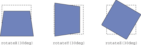
You can also translate on the Z dimension using translateZ(), which moves an element conceptually closer to or further from the user. Similarly, you can rotate an element around axes in all three dimensions. But, unlike translate, rotateZ() is the version you’re already familiar with; that is, rotate() is also aliased as rotateZ() because it rotates around the Z axis. The functions rotateX() and rotateY() rotate around the horizontal X axis (pitching an element forward and back) and around the vertical Y axis (turning—or yawing—the element left or right), respectively. See figure 15.13 for an illustration of these functions.
Figure 15.13. Rotation on each of the three axes with a 300 px perspective applied (a dashed line represents the initial element position)
Before you add 3D transforms to the page, however, you need to specify one more thing—perspective. The transformed elements together form a 3D scene. The browser then computes a 2D image of this 3D scene and renders it onto the screen. You can think of perspective as the distance between the “camera” and the scene. Moving the camera around changes the way the scene appears in the final image.
If the camera is close (that is, the perspective is small), then the 3D effects are much stronger. If the camera is far away (that is, the perspective is large), then the 3D effects are much more subtle. Some different perspectives are shown in figure 15.14.

The rotated element on the left, without a perspective applied, doesn’t look 3D. It appears squashed horizontally; there’s no real feel of depth. 3D transforms without perspective appear flat like this; parts of the element that are “further away” don’t appear any smaller. On the other hand, the box in the middle has a 400 px perspective applied. Its right edge—the edge that’s further from the viewer—appears a little smaller, and the edge that’s nearer appears larger. The perspective applied to the right box is much shorter, at 100 px. This exaggerates the effect so the edge of the element further away shrinks dramatically into the distance.
You can specify this perspective distance in two ways: using a perspective() transform or using the perspective property. Each behaves a little differently. Let’s put together a basic example to illustrate. This example will be minimal, just to show the effects of perspective.
First, you’ll rotate four elements, tilting them back using rotateX() (figure 15.15). Each element is rotated the same and has the same perspective() transform applied; thus, all four elements appear the same.
Figure 15.15. Four elements rotated about the X axis, each with a perspective(200px) transform applied
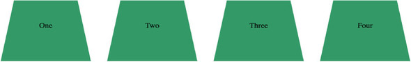
Create a new page for this demo and copy in the HTML shown here.
Listing 15.11. Four boxes to help illustrate 3D transforms and perspective
<div class="row">
  <div class="box">One</div>
  <div class="box">Two</div>
  <div class="box">Three</div>
  <div class="box">Four</div>
</div>
Next, you’ll apply a 3D transform and a perspective transform to each of the boxes. You’ll also add color and padding to fill out the size a bit and to help make the effect more apparent. Add a stylesheet to the page with the code shown in this listing.
Listing 15.12. Applying 3D transforms to the boxes
.row {
  display: flex;
  justify-content: center;
}

.box {
  box-sizing: border-box;
  width: 150px;
  margin: 0 2em;
  padding: 60px 0;
  text-align: center;
  background-color: hsl(150, 50%, 40%);
  transform: perspective(200px) rotateX(30deg);         #1
}
In this example, each box looks the same. Each has its own perspective, applied using the perspective() function. This method applies a perspective to a single element; in this example, you’ve applied it directly to each box. It’s as if four separate pictures were taken of each element, each from the same position.
Sometimes you’ll want multiple elements to share a common perspective, as if they all exist within the same 3D space. Figure 15.16 shows an illustration of this. These are the same four elements, but they all reach into the distance toward a common vanishing point. It’s as if one picture was taken of all four elements together. To achieve this effect, you’ll use the perspective property on their parent element.
Figure 15.16. Make the elements share a common perspective by using the perspective property on a common ancestor element.

To see this effect, remove the perspective() function from the boxes and instead add it to the container using the perspective property. These changes are shown here.
Listing 15.13. Establishing a common perspective
.row {
  display: flex;
  justify-content: center;
  perspective: 200px;                     #1
}

.box {
  box-sizing: border-box;
  width: 150px;
  margin: 0 2em;
  padding: 60px 0;
  text-align: center;
  background-color: hsl(150, 50%, 40%);
  transform: rotateX(30deg);              #2
}
By applying one common perspective to the parent (or other ancestor) container, all the elements within the parent that have 3D transforms applied will share that perspective.
Adding a perspective is an important part of 3D transforms. Without it, elements further from the viewer won’t appear smaller, and those closer won’t appear larger. This example is rather minimal. In the next chapter, you’ll use these techniques in a more practical example to “fly in” some elements onto the page from the distance.
A few other properties can be useful when manipulating elements in 3D. I won’t spend a lot of time on these as real-world use cases for these are few and far between. But it’s good to be aware they exist in case you ever need them. I’ll point you to a few examples online if you want to delve deeper.
By default, the perspective is rendered as if the viewer (or camera) is positioned directly in front of the center of the element. The perspective-origin property shifts the camera position left or right and up or down. Figure 15.17 shows the previous example, but with the camera shifted to the bottom left.
Figure 15.17. Moving the perspective origin increases the perspective distortion of elements toward the far edges.

To see this in your sample page, add the declaration in this listing.
Listing 15.14. Using perspective-origin to move the camera position
.row {
  display: flex;
  justify-content: center;
  perspective: 200px;
  perspective-origin: left bottom;           #1
}
This is the same perspective distance as before, but here the perspective is shifted so all the boxes are to the right of the viewer. You can specify the position using the keywords top, left, bottom, right, and center. You can also use any percentage or length values, measured from the element’s top left corner (perspective-origin: 25% 25%, for example).
If you use rotateX() or rotateY() to spin an element more than 90 degrees, something interesting happens: the “face” of the element is no longer directed toward you. Instead, it is facing away, and you see the back of the element. The element in figure 15.18 has been transformed with rotateY(180deg). It looks like a mirror image of the original.

This is the backface of the element. By default, the backface is visible, but you can change this by applying backface-visibility: hidden to the element. With this declaration applied, the element will only be visible if it’s facing toward the viewer, and hidden if it’s facing away.
One possible application of this technique is to place two elements back-to-back, like two sides of a card. The front of the card will be visible, but the back of the card is hidden. Then you can rotate their container element to flip both elements around, making the front hidden and the back visible. For a demo of this card flip effect, see the article at https://desandro.github.io/3dtransforms/docs/card-flip.html.
The transform-style property becomes important if you go about building complex scenes with nested elements in 3D. Let’s assume you’ve set a perspective on a container, then applied 3D transforms to elements within. That container element, when rendered, will be a 2D representation of that scene. It’s like a photograph of a 3D object. This looks fine because that element must be rendered onto your 2D screen.
If you then apply a 3D rotation on the container itself, it won’t look right. Instead of rotating the entire scene, it’ll appear as if you’re rotating a 2D photograph of a 3D scene. The perspective will be all wrong, and the illusion of depth in the scene is shattered. See figure 15.19 for an example illustrating this.
Figure 15.19. If you perform a 3D transform on the parent of other 3D-transformed elements, you’ll probably want to apply preserve-3d (right).
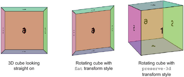
The scene rendered on the left shows a 3D cube created by transforming its six sides into place. The middle image shows what happens if you attempt to transform the entire cube together (that is, the parent element). To correct this, you should apply transform-style: preserve-3d to the parent element (right).
Warning
The preserve-3d transform style is not supported in any version of Internet Explorer.
For a more complete explanation of this, as well as working examples, visit the tutorial from Ana Tudor at https://davidwalsh.name/3d-transforms. Although examples like this are fun to play with, I’ve never needed to use preserve-3d in a real-world project. But if you decide to play around with 3D transforms just to see what you can build, you may find the tutorial useful.
- Use transforms to scale, rotate, translate, and skew elements in two and three dimensions.
- Transforms are essential for performant transitions and animations.
- Understand how the rendering pipeline works and keep it in mind when building animations.
- To use a custom timing function curve to add a bounce effect to transitions.