Chapter 7. Network visualization

published book

This chapter covers

  • Creating adjacency matrices and arc diagrams
  • Using the force-directed layout
  • Using constrained forces
  • Representing directionality
  • Adding and removing network nodes and edges

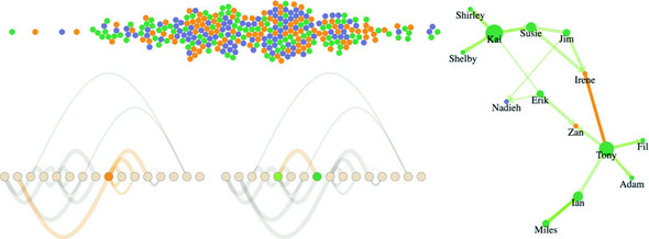
Network analysis and network visualization are more common now with the growth of online social networks like Twitter and Facebook, as well as social media and linked data, all of which are commonly represented with network structures. Network visualizations like the kind you’ll see in this chapter, some of which are shown in figure 7.1, are particularly interesting because they focus on how things are related. They represent systems more accurately than the traditional flat data seen in more common data visualizations.

Figure 7.1. Along with explaining the basics of network analysis (section 7.2.3), this chapter includes laying out networks using xy positioning (section 7.2.5), force-directed algorithms (section 7.2), adjacency matrices (section 7.1.2), and arc diagrams (section 7.1.3).

This chapter focuses on representing networks, so it’s important that you understand a little network terminology as we get started. In general, when dealing with networks you refer to the things being connected (like people) as nodes and the connections between them (such as being a friend on Facebook) as edges or links. Networks may also be referred to as graphs, because that’s what they’re called in mathematics.

Networks aren’t only a data format—they’re a perspective on data. When you work with network data, you typically try to discover and display patterns of the network or of parts of the network, and not of individual nodes in the network. Although you may use a network visualization because it makes a cool graphical index, like a mind map or a network map of a website, in general you’ll find that the typical information visualization techniques are designed to showcase network structure, not individual nodes.

join today to enjoy all our content. all the time.
 

7.1. Static network diagrams

Network data is different from hierarchical data. Networks present the possibility of many-to-many connections, like the Sankey layout from chapter 5, whereas in hierarchical data a node can have many children but only one parent, like the tree and pack layouts from chapter 5. A network doesn’t have to be a social network. This format can represent many different structures, such as transportation networks and linked open data. In this chapter, we’ll look at four common forms for representing networks: as data, as adjacency matrices, as arc diagrams, and using force-directed network diagrams.

In each case, the graphical representation will be quite different. For instance, in the case of a force-directed layout, we’ll represent the nodes as circles and the edges as lines. But in the case of the adjacency matrix, nodes will be positioned on x- and y-axes, and the edges will be filled squares. Networks don’t have a default representation, but the examples you’ll see in this chapter are the most common.

7.1.1. Network data

Network data stores nodes, which can be companies or nucleotides or, in our case, people, and the links that connect them. Those links could be anything, from Facebook friends to molecular interaction. In this chapter, we’re going to get into People Analytics, an exciting new trend in human resources to try to analyze and visualize data related to how organizations perform. It’s data-driven HR, and because HR is all about people, we deal with more interesting datasets than usual—such as text analysis for written reviews or, in our case, network analysis to see team dynamics.

Imagine we have three teams and a couple contractors and every six months they do a 360 review where they give feedback to the people that they worked with over the last six months. At the end of each review, the team member gives a numerical score indicating whether they have confidence in the person they’re reviewing, from 0 (indicating no confidence) to 5 (indicating total confidence). Many Silicon Valley companies do this kind of review, and you can take the reviews that each employee gives and make it a link in a network to create interesting social network analysis graphs. These networks can show us how teams are or aren’t working together as we’d want them to be and allow us to map out key contributors and ways in which we might make our teams stronger.

Although you can store networks in several data formats, the most straightforward is known as an edge list. An edge list is typically represented as a CSV like that shown in listing 7.1, with a source column and a target column, and a string or number to indicate which nodes are connected, resulting in connections and networks like those described in figure 7.2. Each edge may also have other attributes, indicating the type of connection or its strength, the time period when the connection is valid, its color, or any other information you want to store about a connection. The important thing is that only the source and target columns are necessary. It’s hard to indicate negative links (like people who are connected to each other by their deep and abiding hatred, like how you might connect Harry Potter and Voldemort, or Romeo and Tybalt), so we’re only looking at links in our made-up people analytics network where the score is 1 or greater.

Figure 7.2. Some basic kinds of network connections (directed, reciprocated, and undirected) that show up in basic networks like simple directed and undirected networks

In the case of directed networks, the source and target columns indicate the direction of connection between nodes. A directed network means that nodes may be connected in one direction but not in the other. For instance, you could follow a user on Twitter, but that doesn’t necessarily mean the user follows you. Undirected networks still typically have the columns listed as “source” and “target,” but the connection is the same in both directions. Take the example of a network made up of connections indicating people who have shared classes. If I’m in a class with you, you’re likewise in a class with me. You’ll see directed and weighted networks represented throughout this chapter because our sample dataset will be one person’s rating of another, and just because they rated them doesn’t mean they were rated in return (maybe they got a 0 in return, or maybe the other person does a worse job of filling out their 360 reviews).

Listing 7.1. edgelist.csv
source,target,weight
Jim,Irene,5
Susie,Irene,5
Jim,Susie,5
Susie,Kai,5
Shirley,Kai,5
Shelby,Kai,5
Kai,Susie,5
Kai,Shirley,5
Kai,Shelby,5
Erik,Zan,5
Tony,Zan,5
Tony,Fil,5
Tony,Ian,5
Tony,Adam,5
Fil,Tony,4
Ian,Miles,1
Adam,Tony,3
Miles,Ian,2
Miles,Ian,3
Erik,Kai,2
Erik,Nadieh,2
Jim,Nadieh,2

Reading this dataset, you can see that Jim and Susie both have total confidence in Irene, whereas Irene either gave anyone connected to her a 0 or didn’t get around to doing her 360 reviews (which happens a lot, and the lack of connection is itself something key to visualize with datasets like this). This is a weighted network because the edges have a value. It’s a directed network because the edges have direction. Therefore, we have a weighted directed network, and we need to account for both weight and direction in our network visualizations.

Technically, you only need an edge list to create a network, because you can derive a list of nodes from the unique values in the edge list. This is done by traditional network analysis software packages like Gephi. Although you can derive a node list with JavaScript, it’s more common to have a corresponding node list that provides more information about the nodes in your network, like we have in the following listing.

Listing 7.2. nodelist.csv
id,role,salary
Irene,manager,300000
Zan,manager,380000
Jim,employee,150000
Susie,employee,90000
Kai,employee,135000
Shirley,employee,60000
Erik,employee,90000
Shelby,employee,150000
Tony,employee,72000
Fil,employee,35000
Adam,employee,85000
Ian,employee,83000
Miles,employee,99000
Sarah,employee,160000
Nadieh,contractor,240000
Hajra,contractor,280000

Because these are employees, we have a bit more information about them besides their links—in this case, their role and their salary. As with the edge list, it’s not necessary to have more than an ID. But having access to more data gives you the chance to modify your network visualization to reflect the node attributes. We’ll use role to color the later networks (managers in orange, employees in green, and contractors in purple).

How you represent a network depends on its size and nature. If a network doesn’t represent discrete connections between similar things, but rather the flow of goods or information or traffic, then you could use a Sankey diagram as we did in chapter 5. Recall that the data format for the Sankey is exactly the same as what we have here: a table of nodes and a table of edges. The Sankey diagram is only suitable for specific kinds of network data. Other chart types, such as an adjacency matrix, are more generically useful for network data.

Before we get started with code to create a network visualizations, let’s put together a CSS page so that we can set color based on class and use inline styles as little as possible. Listing 7.3 gives the CSS necessary for all the examples in this chapter. Keep in mind that we’ll still need to set some inline styles when we want the numerical value of an attribute to relate to the data bound to that graphical element—for example, when we base the stroke-width of a line on the strength of that line.

Listing 7.3. networks.css
.grid {
  stroke: #9A8B7A;
  stroke-width: 1px;
  fill: #CF7D1C;
}
.arc {
  stroke: #9A8B7A;
  fill: none;
}
.node {                             #1
  fill: #EBD8C1;
  stroke: #9A8B7A;
  stroke-width: 1px;
}
circle.active {
  fill: #FE9922;
}
path.active {
  stroke: #FE9922;
}
circle.source {
  fill: #93C464;
}
circle.target {
  fill: #41A368;
}

7.1.2. Adjacency matrix

As you see more and more networks represented graphically, it seems like the only way to represent a network is with a circle or square that represents the node and a line (whether straight or curvy) that represents the edge. It may surprise you that one of the most effective network visualizations has no connecting lines at all. Instead, the adjacency matrix uses a grid to represent connections between nodes, with the graphical rules of the chart as described in figure 7.3.

Figure 7.3. How edges are described graphically in an adjacency matrix. In this kind of diagram, the nodes are listed on the axes as columns, and a connection is indicated by a shaded cell where those columns intersect.

The principle of an adjacency matrix (a two-node example is seen in the figure) is simple: you place the nodes along the x-axis and then place the same nodes along the y-axis. If two nodes are connected, then the corresponding grid square is filled; otherwise, it’s left blank. In our case, because it’s a directed network, the nodes along the y-axis are considered the source, and the nodes along the x-axis are considered the target, as you’ll see in a few pages. Because our people analytics network is also weighted, we’ll use saturation to indicate weight, with lighter colors indicating a weaker connection and darker colors indicating a stronger connection.

The only problem with building an adjacency matrix in D3 is that it doesn’t have an existing layout, which means you have to build it by hand like we did with the bar chart, scatterplot, and boxplot. Mike Bostock has an impressive example at http://bost.ocks.org/mike/miserables/, but you can make something that’s functional without too much code, which we’ll do with the function in listing 7.4. In doing so, though, we need to process the two arrays of JavaScript objects that are created from our CSVs and format the data so that it’s easy to work with. This is getting close to writing our own layout, something we’ll do in chapter 10, and a good idea generally.

One thing you’ll notice in listing 7.4 that might intimidate you is the Promise API. Promises are asynchronous functions that fire a resolve or reject event when the asynchronous call finishes. We’re not using them for fancy async behavior—we’re using them so that we can fire Promise.all, which lets us pass an array of promises and only fires a function once all those promises have been resolved or one of them has been rejected. The simple promise wrapper we see in the listing 7.4 is how you might wrap a callback function like d3.csv so that it resolves as a promise. It’s better to use core ES6 functionality like this, which you will run into in industry, than helper libraries like, say, d3.queue. I decided to use promises for any example where we need to wait for the asynchronous behavior of two or more functions because I think it’s going to serve you best to get exposed to and familiar with promises rather than a D3-specific approach.

Listing 7.4. The adjacency matrix function
function adjacency() {
  var PromiseWrapper = d => new Promise(resolve => d3.csv(d, p => resolve(p)))#1
     Promise.all([PromiseWrapper("nodelist.csv"),
            PromiseWrapper("edgelist.csv")])
         .then(resolve => {
           createAdjacencyMatrix(resolve[0], resolve[1])                      #2
         })

     function createAdjacencyMatrix(nodes, edges) {
       var edgeHash = {};
       edges.forEach(edge => {
         var id = edge.source + "-" + edge.target;
         edgeHash[id] = edge;                                                 #3
       })

       var matrix = [];
       nodes.forEach((source, a) => {
         nodes.forEach((target, b) => {                                       #4
         var grid =
           {id: source.id + "-" + target.id,
                x: b, y: a, weight: 0};                                       #5
          if (edgeHash[grid.id]) {
            grid.weight = edgeHash[grid.id].weight;                           #6
          }
          matrix.push(grid);
        })
      })

      d3.select("svg")
        .append("g")
        .attr("transform", "translate(50,50)")
        .attr("id", "adjacencyG")
        .selectAll("rect")
        .data(matrix)
        .enter()
        .append("rect")
        .attr("class", "grid")
        .attr("width", 25)
        .attr("height", 25)
        .attr("x", d => d.x * 25)
        .attr("y", d => d.y * 25)
        .style("fill-opacity", d => d.weight * .2)

      d3.select("svg")                                                        #7
        .append("g")
        .attr("transform", "translate(50,45)")
        .selectAll("text")
        .data(nodes)
        .enter()
        .append("text")
        .attr("x", (d,i) => i * 25 + 12.5)
        .text(d => d.id)
        .style("text-anchor", "middle")

      d3.select("svg")                                                        #8
        .append("g")
        .attr("transform", "translate(45,50)")
        .selectAll("text")
        .data(nodes)
        .enter()
        .append("text")
        .attr("y", (d,i) => i * 25 + 12.5)
        .text(d => d.id)
        .style("text-anchor", "end")
    };
  };

We’re building this matrix array of objects that may seem obscure. But if you examine it in your console, you’ll see, as in figure 7.4, that it’s a list of every possible connection and the strength of that connection, if it exists.

Figure 7.4. The array of connections we’re building. Notice that every possible connection is stored in the array. Only those connections that exist in our dataset have a weight value other than 0. Also note that our CSV import creates the weight value as a string.

Figure 7.5 shows the resulting adjacency matrix based on the node list and edge list.

Figure 7.5. A weighted, directed adjacency matrix where lighter orange indicates weaker connections and darker orange indicates stronger connections. The source is on the y-axis, and the target is on the x-axis. The matrix shows that Sarah, Nadieh, and Hajra didn’t give anyone feedback, whereas Kai gave Susie feedback, and Susie gave Kai feedback (what we call a reciprocated tie in network analysis).

You’ll notice in many adjacency matrices that the square indicating the connection from a node to itself is always filled. In network parlance this is a self-loop, and it occurs when a node is connected to itself. In our case, it would mean that someone gave themselves positive feedback, and fortunately no one in our dataset is a big enough loser to do that.

If we want, we can add interactivity to help make the matrix more readable. Grids can be hard to read without something to highlight the row and column of a square. It’s simple to add highlighting to our matrix. All we have to do is add a mouseover event listener that fires a gridOver function to highlight all rectangles that have the same x or y value:

d3.selectAll("rect.grid").on("mouseover", gridOver);
function gridOver(d) {
  d3.selectAll("rect").style("stroke-width", p =>
  p.x == d.x || p.y == d.y ? "4px" : "1px");
};

Now you can see in figure 7.6 how moving your cursor over a grid square highlights the row and column of that grid square.

Figure 7.6. Adjacency highlighting of the column and row of the grid square. In this instance, the mouse is over the Erik-to-Kai edge, and as a result highlights the Erik row and the Kai column. You can see that Erik gave feedback to three people, whereas Kai received feedback from four people.

7.1.3. Arc diagram

Another way to graphically represent networks is by using an arc diagram. An arc diagram arranges the nodes along a line and draws the links as arcs above and/or below that line (as seen in figure 7.7). Whereas adjacency matrices let you see edge dynamics quickly, arc diagrams let you see node dynamics quickly. You can see which nodes are isolated and which nodes have many connections, as well as get a ready sense of the directionality of those connections.

Figure 7.7. The components of an arc diagram are circles for nodes and arcs for connections, with nodes laid out along a baseline and the location of the arc relative to that baseline indicative of the direction of the connection.

Again, there isn’t a layout available for arc diagrams, and there are even fewer examples, but the principle is rather simple after you see the code. We build another pseudo-layout like we did with the adjacency matrix, but this time we need to process the nodes as well as the links, as shown in listing 7.5.

Listing 7.5. Arc diagram code
  function createArcDiagram(nodes,edges) {                         #1
   var nodeHash = {};
   nodes.forEach((node, x) => {
     nodeHash[node.id] = node;                                     #2
     node.x = parseInt(x) * 30;                                    #2
   })
   edges.forEach(edge => {
     edge.weight = parseInt(edge.weight);
     edge.source = nodeHash[edge.source];                          #3
     edge.target = nodeHash[edge.target];                          #3
   })

   var arcG = d3.select("svg").append("g").attr("id", "arcG")
        .attr("transform", "translate(50,250)");

   arcG.selectAll("path")
      .data(edges)
      .enter()
      .append("path")
      .attr("class", "arc")
      .style("stroke-width", d => d.weight * 2)
      .style("opacity", .25)
      .attr("d", arc)
   arcG.selectAll("circle")
      .data(nodes)
      .enter()
      .append("circle")
      .attr("class", "node")
      .attr("r", 10)
      .attr("cx", d => d.x)

   function arc(d,i) {                                             #4
     var draw = d3.line().curve(d3.curveBasis)
     var midX = (d.source.x + d.target.x) / 2
     var midY = (d.source.x - d.target.x)
     return draw([[d.source.x,0],[midX,midY],[d.target.x,0]])
   }
 }

Notice that the edges array that we built uses a hash with the ID value of our edges to create object references. By building objects that have references to the source and target nodes, we can easily calculate the graphical attributes of the <line> or <path> element we’re using to represent the connection. This is the same method used in the force layout that we’ll look at later in the chapter. The result of the code is your first arc diagram, shown in figure 7.8.

Figure 7.8. An arc diagram, with connections between nodes represented as arcs above and below the nodes. We can see the first (left) two nodes have no outgoing links, and the rightmost three nodes also have no outgoing links. The length of the arcs is meaningless and based on how we’ve laid the nodes out (nodes that are far away will have longer links), but the width of the arcs is based on the weight of the connection.

With abstract charts like these, you’re getting to the point where interactivity is no longer optional. Even though the links follow rules, and you’re not dealing with too many nodes or edges, it can be hard to make out what’s connected to what and how. You can add useful interactivity by having the edges highlight the connecting nodes on mouseover. You can also have the nodes highlight connected edges on mouseover by adding two new functions, as shown in listing 7.6, with the results in figure 7.9.

Figure 7.9. Mouseover behavior on edges (right), with the edge being moused over in orange, the source node in light green, and the target node in dark green. Mouseover behavior on nodes (left), with the node being moused over in orange and the connected edges in light orange.
Listing 7.6. Arc diagram interactivity
d3.selectAll("circle").on("mouseover", nodeOver)
d3.selectAll("path").on("mouseover", edgeOver)
function nodeOver(d) {
   d3.selectAll("circle").classed("active", p => p === d)          #1
   d3.selectAll("path").classed("active", p => p.source === d
          || p.target === d)                                       #2
}
function edgeOver(d) {
   d3.selectAll("path").classed("active", p => p === d)
   d3.selectAll("circle")
      .classed("source", p => p === d.source)                      #3
      .classed("target", p => p === d.target)                      #3
}

If you’re interested in exploring arc diagrams further and want to use them for larger datasets, you’ll also want to look into hive plots, which are arc diagrams arranged on spokes. We won’t deal with hive plots in this book, but there’s a plugin layout for hive plots that you can see at https://github.com/d3/d3-plugins/tree/master/hive. Both the adjacency matrix and arc diagram benefit from the control you have over sorting and placing the nodes, as well as the linear manner in which they’re laid out.

The next method for network visualization, which is our focus for the rest of the chapter, uses entirely different principles for determining how and where to place nodes and edges.

Get D3.js in Action, Second Edition
add to cart

7.2. Force-directed layout

The force layout gets its name from the method by which it determines the most optimal graphical representation of a network (yet another instance of bad naming in data visualization). Like the word cloud and the Sankey diagram from chapter 5, the force() layout dynamically updates the positions of its elements to find the best fit. Unlike those layouts, it does it continuously in real time rather than as a preprocessing step before rendering. The principle behind a force layout is the interplay between three forces, shown in figure 7.10. These forces push nodes away from each other, attract connected nodes to each other, and keep nodes from flying out of sight.

Figure 7.10. The forces in a force-directed algorithm: attraction/repulsion, gravity, and link attraction. Other factors, such as hierarchical packing and community detection, can also be factored into force-directed algorithms, but the aforementioned features are the most common. Forces are approximated for larger networks to improve performance.

In this section, you’ll learn how force-directed layouts work, how to make them, and general principles from network analysis that will help you better understand them. You’ll also learn how to add and remove nodes and edges, as well as adjust the settings of the layout on the fly.

7.2.1. Playing with forces

Before we get into networks with links, let’s look at a couple of forces to start with: x, y, charge, and collision. To initialize forces, you have to first initialize d3.forceSimulation, which calculates the effects of your forces and from which you draw your network. With the code in listing 7.7, we’ll initialize a random dataset to play with and create a simple forceSimulation with only the manyBody force attracting nodes to each other.

Listing 7.7. An initial force simulation with no links or collision detection
var roleScale = d3.scaleOrdinal()
  .range(["#75739F", "#41A368", "#FE9922"])

var sampleData = d3.range(100).map((d,i) => ({r: 50 - i * .5}))      #1

var manyBody = d3.forceManyBody().strength(10)                       #2
var center = d3.forceCenter().x(250).y(250)                          #3

var.force("charge", manyBody)                                        #4
   .force("center", center)                                          #4
   .nodes(sampleData)                                                #5
   .on("tick", updateNetwork)                                        #6

d3.select("svg")
   .selectAll("circle")
   .data(sampleData)                                                 #7
   .enter()
   .append("circle")
   .style("fill", (d, i) => roleScale(i))
   .attr("r", d => d.r)

function updateNetwork() {
   d3.selectAll("circle")
     .attr("cx", d => d.x)                                           #8
     .attr("cy", d => d.y)
}

Your first implementation of forceSimulation is going to be pretty unimpressive, though, with results looking something like figure 7.11. The circles will bounce around a bit and finally settle on top of each other—which, if you think about it, is exactly what you might expect if you made all the circles attractive to each other.

Figure 7.11. The results of a force simulation where the only force acting on the nodes is attraction

To make this a bit more interesting, let’s register a “collide” force using d3.force-Collide and setting it to base the collision detection off the size of each node (its .r attribute):

.force("collision", d3.forceCollide(d => d.r))

With this in place, we get a simple bubble chart of our data, as we see in figure 7.12.

Figure 7.12. Our sample node data laid out with collision detection. This is one way to create a simple bubble chart.

The last thing we want to look at is using x- and y-constraints to lay out our nodes. If we replace our random data with normally distributed random data and add an x-constraint to keep it in a line and a y-constraint to have its y position correspond to its value, we can produce a beeswarm plot, as in the following listing.

Listing 7.8. Code modifications for a beeswarm plot
var sampleData = d3.range(300).map(() =>
({r: 2, value: 200 + d3.randomNormal()() * 50}))                 #1
...
  var force = d3.forceSimulation()
    .force("collision", d3.forceCollide(d => d.r))
    .force("x", d3.forceX(100))                                  #2
    .force("y", d3.forceY(d => d.value).strength(3))             #3
    .nodes(sampleData)
    .on("tick", updateNetwork)

The result of your simulation this time tries to arrange each node in a way that they’re laid out along a shared x-axis but positioned to show their value. This beeswarm plot, as you see in figure 7.13, is pretty popular and allows you to show distributions while maintaining individual sample points.

Figure 7.13. A beeswarm plot created with our code (rotated to better fit on the page)

7.2.2. Creating a force-directed network diagram

The forceSimulation()layout that you’ve been using and which you see initialized in listing 7.9 has even more settings. The nodes() method that we already used is similar to the one you saw in the Sankey layout in chapter 5, but links in forceSimulation are registered with a “link” force that takes, as you’d expect, the settings for how the links describe source and target as well as an array of those links. We need to take the links from edges.csv and change the source and target into objects like we did with the arc diagram. That’s the formatting that forceSimulation() expects. It also accepts integer values where the integer values correspond to the array position of a node in the nodes array, like the formatting of data for the Sankey diagram links array from chapter 5. Other than the links force, the only new setting we have is to use forceManyBody with a negative value, meaning that nodes will push each other away. This will result in connected nodes attracted to connected nodes and create the kind of network diagram people are familiar with.

Listing 7.9. Force layout function
function createForceLayout(nodes,edges) {
var roleScale = d3.scaleOrdinal()
  .domain(["contractor", "employee", "manager"])
  .range(["#75739F", "#41A368", "#FE9922"])

     var nodeHash = nodes.reduce((hash, node) => {hash[node.id] = node;
return hash;
}, {})

     edges.forEach(edge => {
        edge.weight = parseInt(edge.weight)
        edge.source = nodeHash[edge.source]
        edge.target = nodeHash[edge.target]
      })

    var linkForce = d3.forceLink()

    var simulation = d3.forceSimulation()
     .force("charge", d3.forceManyBody().strength(-40))         #1
     .force("center", d3.forceCenter().x(300).y(300))
     .force("link", linkForce)
     .nodes(nodes)
     .on("tick", forceTick)

   simulation.force("link").links(edges)

   d3.select("svg").selectAll("line.link")
      .data(edges, d => `${d.source.id}-${d.target.id}`)        #2
      .enter()
      .append("line")
      .attr("class", "link")
      .style("opacity", .5)
      .style("stroke-width", d => d.weight);

   var nodeEnter = d3.select("svg").selectAll("g.node")         #2
      .data(nodes, d => d.id)
      .enter()
      .append("g")
      .attr("class", "node");
   nodeEnter.append("circle")
      .attr("r", 5)
      .style("fill", d => roleScale(d.role))
   nodeEnter.append("text")
      .style("text-anchor", "middle")
      .attr("y", 15)
      .text(d => d.id);

   function forceTick() {
     d3.selectAll("line.link")
        .attr("x1", d => d.source.x)
        .attr("x2", d => d.target.x)
        .attr("y1", d => d.source.y)
        .attr("y2", d => d.target.y)
     d3.selectAll("g.node")
        .attr("transform", d => `translate(${d.x},${d.y})`)
   }
}

The animated nature of the force layout is lost on the page, but you can see in figure 7.14 general network structure that’s less prominent in an adjacency matrix or arc diagram. It’s readily apparent that there are dense and sparse parts of the network, with key brokers like Zan who connect two different groups. We can also see that two people aren’t connected to anyone, having neither given nor received feedback. The only reason those nodes are still onscreen is because the layout’s gravity pulls unconnected pieces toward the center. We can see that our two managers both gave feedback to only two people, but that they have different positions in the structure of our two teams. If Irene quit tomorrow, there wouldn’t be much change in this network, but if Zan quit, then the two teams wouldn’t have any communication with each other.

Figure 7.14. A force-directed layout based on our dataset and organized graphically using default settings in the force layout. Managers are in orange, employees green, and contractors purple.

The thickness of the lines corresponds to the strength of connection. But although we have edge strength, we’ve lost the direction of the edges in this layout. You can tell that the network is directed only because the links are drawn as semitransparent, so you can see when two links of different weights overlap each other. We need to use a method to show if these links are to or from a node. One way to do this is to turn our lines into arrows using SVG markers.

7.2.3. SVG markers

Sometimes you want to place a symbol, such as an arrowhead, on a line or path that you’ve drawn. In that case, you have to define a marker in your svg:defs and then associate that marker with the element on which you want it to draw. You can define your marker statically in HTML or create it dynamically like any SVG element, as we’ll do next. The marker we define can be any sort of SVG shape, but we’ll use a path because it lets us draw an arrowhead. A marker can be drawn at the start, end, or middle of a line, and has settings to determine its direction relative to its parent element. See the following listing.

Listing 7.10. Marker definition and application
var marker = d3.select("svg").append('defs')
   .append('marker')
   .attr("id", "triangle")
   .attr("refX", 12)
   .attr("refY", 6)
   .attr("markerUnits", 'userSpaceOnUse')                     #1
   .attr("markerWidth", 12)
   .attr("markerHeight", 18)
   .attr("orient", 'auto')
   .append('path')
   .attr("d", 'M 0 0 12 6 0 12 3 6');
d3.selectAll("line").attr("marker-end", "url(#triangle)");    #2

With the markers defined in listing 7.10, you can now read the network (as shown in figure 7.15) more effectively. You see how the nodes are connected to each other and you can spot which nodes have reciprocal ties with each other (where nodes are connected in both directions). Reciprocation is important to identify, because there’s a big difference between people who favorite Katy Perry’s tweets and people whose tweets are favorited by Katy Perry (the current Twitter user with the most followers). Direction of edges is important, but you can represent direction in other ways, such as using curved edges or edges that grow fatter on one end than the other. To do something like that, you’d need to use a <path> rather than a <line> for the edges like we did with the Sankey layout or the arc diagram.

Figure 7.15. Edges now display markers (arrowheads) indicating the direction of connection. Notice that all the arrowheads are the same size. You can control the color of the arrowheads by using CSS rules such as marker > path {fill: # 93C464;}.

If you’ve run this code on your own, your network should look exactly like figure 7.15. That’s because even though network visualizations created with force-directed layouts are the result of the interplay of forces, D3’s force simulation is deterministic as long as the inputs don’t change. However, if your network inputs are constantly changing, one way to help your readers is to generate a network using a force-directed layout and then fix it in place to create a network basemap. You can then apply any later graphical changes to that fixed network. The concept of a basemap comes from geography and in network visualization refers to the use of the same layout with differently sized and/or colored nodes and edges. It allows readers to identify regions of the network that are significantly different according to different measures. You can see this concept of a basemap in use in figure 7.16, which shows how one network can be measured in multiple ways.

Figure 7.16. The same network measured using degree centrality (top left), closeness centrality (top right), eigenvector centrality (bottom left), and betweenness centrality (bottom right). We’ll only see degree centrality, but you can explore the others with libraries like jsnetworkx.js. More-central nodes are larger and bright red, whereas less-central nodes are smaller and gray. Notice that although some nodes are central according to all measures, their relative centrality varies, as does the overall centrality of other nodes.
Infoviz term: hairball

Network visualizations are impressive, but they can also be so complex that they’re unreadable. For this reason, you’ll encounter critiques of networks that are too dense to be readable. These network visualizations are often referred to as hairballs due to extensive overlap of edges that make them resemble a mass of unruly hair.

If you think a force-directed layout is hard to read, you can pair it with another network visualization such as an adjacency matrix and highlight both as the user navigates either visualization. You’ll see techniques for pairing visualizations like this in chapter 11.

The force-directed layout provides the added benefit of seeing larger structures. Depending on the size and complexity of your network, they may be enough. But you may need to represent other network measurements when working with network data.

7.2.4. Network measures

Networks have been studied for a long time—at least for decades; if you consider graph theory in mathematics, for centuries. As a result, you may encounter a few terms and measures when working with networks. This is only meant to be a brief overview. If you want to learn more about networks, I would suggest reading the excellent introduction to networks and network analysis by S. Weingart, I. Milligan, and S. Graham at www.themacroscope.org/?page_id=337.

Edge weight

You’ll notice that our dataset contains a weight value for each link. This represents the strength of the connection between two nodes. In our case, we assume that the more favorites, the stronger a connection that one Twitter user has. I drew thicker lines for a higher weight, but we can also adjust the way the force layout works based on that weight, as you’ll see next.

Centrality

Networks are representations of systems, and one of the things you want to know about the nodes in a system is which ones are more important than the others, referred to as centrality. Central nodes are considered to have more power or influence in a network. There are many different measurements of centrality, a few of which are shown in figure 7.16, and different measures more accurately assess centrality in different network types.

Degree

Degree, also known as degree centrality, is the total number of links that are connected to a node. In our example data, Mo has a degree of 6, because he’s the source or target of 6 links. Degree is a rough measure of the importance of a node in a network, because you assume that people or things with more connections have more power or influence in a network. Weighted degree is used to refer to the total value of the connections to a node, which would give Mo a value of 18. Further, you can differentiate degree into in degree and out degree, which are used to distinguish between incoming and outgoing links, and which for Mo’s case would be 4 and 2, respectively.

You can calculate degree centrality easily by filtering the edges array to show only links that involve that node:

nodes.forEach(d => {
  d.degreeCentrality = edges.filter(
    p => p.source === d || p.target === d).length
})

We’ll use that to affect the way the force layout runs. For now, let’s add a button that resizes the nodes based on their weight attribute:

d3.select("#controls").append("button")
  .on("click", sizeByDegree).html("Degree Size")
function sizeByDegree() {
  simulation.stop()
  simulation.force("charge", d3.forceManyBody()
    .strength(d => -d.degreeCentrality * 20))
  simulation.restart()
  d3.selectAll("circle")
    .attr("r", d => d.degreeCentrality * 2)
}

Figure 7.17 shows the value of the degree centrality measure. Although you can see and easily count the connections and nodes in this small network, being able to spot at a glance the most and least connected nodes is extremely valuable. Notice that we’re counting links in both directions, so that even though Kai and Tony are connected to the same number of people, Kai’s circle is slightly larger because he’s involved in more connections total (to and from).

Figure 7.17. Sizing nodes by weight indicates the number of total connections for each node by setting the radius of the circle equal to the weight times 2.
Clustering and modularity

One of the most important things to find out about a network is whether any communities exist in that network and what they look like. This is done by looking at whether certain nodes are more connected to each other than to the rest of the network, known as modularity. You can also look at whether nodes are interconnected, known as clustering. Cliques, mentioned earlier, are part of the same measurement, and clique is a term for a group of nodes that are fully connected to each other.

Notice that this interconnectedness and community structure are supposed to arise visually out of a force-directed layout. You see the four highly connected users in a cluster and the other users farther away. If you’d prefer to measure your networks to try to reveal these structures, you can see an implementation of a community detection algorithm implemented in libraries like jLouvain at https://github.com/upphiminn/jLouvain. This algorithm runs in the browser and can be integrated with your network quite easily to color your network based on community membership or even organize the network visually based on module as you can see here:

7.2.5. Force layout settings

When we initialized our force layout, we started out with a charge setting of –1000. Charge and a few other settings give you more control over the way the force layout runs.

Charge

Charge sets the rate at which nodes push each other away or attract each other. If you don’t set the charge strength, then it has a default setting of –30. Along with setting fixed values for charge, you can use an accessor function to base the charge values on an attribute of the node. For instance, you could base the charge on the weight (the degree centrality) of the node so that nodes with many connections push nodes away more, giving them more space on the chart.

Negative charge values represent repulsion in a force-directed layout, but you could set them to positive if you wanted your nodes to exert an attractive force. This would cause problems with a traditional network visualization but may come in handy for a more complicated visualization.

Gravity

With This used to be a universal gravity setting that has now been replaced by independent x- and y-constraints. The other way to center your network, which we’ve been using, is to visually center it using the center constraint. You’ll want to experiment with gravity when that visual centering isn’t enough.

linkForce

Attraction between nodes is determined by setting the strength property of the “link” force. Setting your link.strength() parameter too high causes your network to fold back in on itself, which you can identify by the presence of prominent triangles in the network visualization.

You can set link.strength to be a function and associate it with edge weight so that edges with higher or lower weight values have lower or higher distance settings. A force layout is a physical simulation, meaning it uses physical metaphors to arrange the network to its optimal graphical shape. If your network has stronger and weaker links, as our example does, then it makes sense to have those edges exert stronger and weaker effects on the controlling nodes. As a result, people who have rated their confidence in their coworkers higher will be visually closer to those coworkers than people who have rated their confidence as lower:

    var linkForce = d3.forceLink().strength(d => d.weight * .1)

    var simulation = d3.forceSimulation()
      .force("charge", d3.forceManyBody().strength(-500))
      .force("x", d3.forceX(250))
      .force("y", d3.forceY(250))

We’re ramping up the repulsive charge because we’re increasing the maximum link strength to 10. We’re also using canvas gravity with x and y forces because that repulsive charge will push nodes offscreen. Figure 7.18 dramatically demonstrates the results, which reflect the weak nature of several of the connections.

Figure 7.18. By basing the strength of the attraction between nodes on the strength of the connections between nodes, you see a dramatic change in the structure of the network. The weaker connections between x and y allow that part of the network to drift away.

7.2.6. Updating the network

When you create a network, you want to provide your users with the ability to add or remove nodes to the network, or drag them around. You may also want to adjust the various settings dynamically rather than changing them when you first create the force layout.

Stopping and restarting the layout

The force layout is designed to “cool off” and eventually stop after the network is laid out well enough that the nodes no longer move to new positions. When the layout has stopped like this, you’ll need to restart it if you want it to animate again. Also, if you’ve made any changes to the force settings or want to add or remove parts of the network, then you’ll need to stop it and restart it.

stop()

You can turn off the force interaction by using simulation.stop(), which stops running the simulation. It’s good to stop the network when there’s an interaction with a component elsewhere on your web page or a change in the styling of the network, and then restart it once that interaction is over.

restart()

To begin or restart the animation of the layout, use simulation.restart(). You don’t have to start the simulation when you first create it, it’s started automatically.

tick()

Finally, if you want to move the layout forward one step, you can use simulation.tick(). Force layouts can be resource-intensive, and you may want to use one for a few seconds rather than let it run continuously. You can also precalculate your chart if you don’t need the fancy animation, so you could simulation.tick(120) to precalculate your beeswarm plot before you lay it out. Simulating the network without graphically animating it is much faster, and you can use D3 transitions to animate the movement of the nodes to their final precalculated position.

force.drag()

With traditional network analysis programs, the user can drag nodes to new positions. This is implemented using the behavior d3.drag(). A behavior is like a component in that it’s called by an element using .call(), but instead of creating SVG elements, it creates a set of event listeners.

In the case of d3.drag(), those event listeners correspond to dragging events that give you the ability to click and drag your nodes around while the force layout runs. You can enable dragging on all your nodes by selecting them and calling d3.drag() on that selection. See the following listing.

Listing 7.11. Setting up drag for networks
var drag = d3.drag()
drag
     .on("drag", dragging)                   #1

function dragging(d) {
    var e = d3.event                         #2
    d.fx = e.x                               #3
    d.fy = e.y
    if (simulation.alpha() < 0.1) {
      simulation.alpha(0.1)                  #4
      simulation.restart()
    }
}

d3.selectAll("g.node").call(drag);           #5
Fixed node positions

As a force layout runs, it checks to see if each node has .fx or .fy attributes and doesn’t adjust the x and/or y position of nodes that have them. One effective interaction technique is to set a node as fixed when the user interacts with it. This allows users to drag nodes to a position on the canvas so they can visually sort the important nodes. The effect of dragging some of our nodes is shown in figure 7.19.

Figure 7.19. The two nodes representing managers have been dragged to the top corners, allowing the rest of the nodes to take their positions based on the forces of the simulation (being dragged toward the center along with being dragged toward the fixed nodes).

7.2.7. Removing and adding nodes and links

When dealing with networks, you may want to filter the networks or give the user the ability to add or remove nodes. To filter a network, you need to stop() it, remove any nodes and links that are no longer part of the network, rebind those arrays to the force layout, and then restart() the layout.

This can be done as a filter on the array that makes up your nodes. For instance, we may want to only see the network without contractors and managers, so we can see who the most influential peers are and how only the employee network looks.

If we got rid of the nodes, we’d still have links in our layout that reference nodes which no longer exist. We’ll need a more involved filter for our links array. By using the .indexOf function of an array, though, we can easily create our filtered links by checking to see if the source and target are both in our filtered nodes array. Because we used key values when we first bound our arrays to our selection in listing 7.12, we can use the selection.exit() behavior to easily update our network. You can see how to do this in the following listing and the effects in figure 7.20.

Figure 7.20. The network has been filtered to only show nodes that are not managers or contractors. This figure catches two processes in midstream, the transition of nodes from full to 0 opacity, and the removal of edges.
Listing 7.12. Filtering a network
function filterNetwork() {
   simulation.stop()
   var originalNodes = simulation.nodes()                                  #1
   var originalLinks = simulation.force("link").links()                    #1

   var influentialNodes = originalNodes.filter(d => d.role === "employee") #2
   var influentialLinks = originalLinks.filter(d =>
        influentialNodes.includes(d.source) &&
        influentialNodes.includes(d.target))                               #2

   d3.selectAll("g.node")
      .data(influentialNodes, d => d.id)
      .exit()
      .transition()
      .duration(4000)
      .style("opacity", 0)
      .remove()

   d3.selectAll("line.link")
      .data(influentialLinks, d => `${d.source.id}-${d.target.id}`)
      .exit()
      .transition()
      .duration(3000)
      .style("opacity", 0)                                                 #3
      .remove()

   simulation
      .nodes(influentialNodes)                                             #4
   simulation.force("link")
      .links(influentialLinks)
   simulation.alpha(0.1)
   simulation.restart()
}

Because the force algorithm is restarted after the filtering, you can see how the shape of the network changes with the removal of so many nodes. That animation is important because it reveals structural changes in the network.

Putting more nodes and edges into the network is easy, as long as you properly format your data. You stop the force layout, add the properly formatted nodes or edges to the respective arrays, and rebind the data as you’ve done in the past. Let’s say we want to convince Irene to work more closely with someone from Zan’s team. We’d probably suggest Tony, because he’s so well connected on our diagram. If, for instance, we want to add an edge between Irene and Tony, as shown in figure 7.21, we need to stop the force layout like we did earlier, create a new datapoint for that edge, and add it to the array we’re using for the links, as shown in listing 7.13. Then we rebind the data and append a new line element for that edge before we restart the force layout.

Figure 7.21. Network with a new edge added

Now Irene can see visually that she’s occupying a more central position in the network, and the organization as a whole can see that the network is more resilient to any personnel changes that may happen. See the following listing.

Listing 7.13. A function for adding edges
function addEdge() {
    simulation.stop()
    var links = simulation.force("link").links()
    var nodes = simulation.nodes()
    var newEdge = {source: nodes[0], target: nodes[8], weight: 5}
    links.push(newEdge)
    simulation.force("link").links(links)
    d3.select("svg").selectAll("line.link")
    .data(links, d => `${d.source.id}-${d.target.id}`)
    .enter()
    .insert("line", "g.node")
    .attr("class", "link")
    .style("stroke", "#FE9922")
    .style("stroke-width", 5)

    simulation.alpha(0.1)
    simulation.restart()
}

Now let’s imagine that Shirley wants to bring in a pair of contractors to work on a new project, so we have two new nodes and the corresponding links we need to add, as shown in figure 7.22. The code and process, which you can see in listing 7.14, should look familiar to you by now.

Figure 7.22. Network with two new nodes added (Mike and Noah), both with links to Sam
Listing 7.14. Function for adding nodes and edges
function addNodesAndEdges() {
   simulation.stop()
   var oldEdges = simulation.force("link").links()
   var oldNodes = simulation.nodes()
   var newNode1 = {id: "Mike", role: "contractor", team: "none"}          #1
   var newNode2 = {id: "Noah", role: "contractor", team: "none"}          #1
   var newEdge1 = {source: oldNodes[5], target: newNode1, weight: 5}      #2
   var newEdge2 = {source: oldNodes[5], target: newNode2, weight: 5}      #2
   oldEdges.push(newEdge1,newEdge2)                                       #3
   oldNodes.push(newNode1,newNode2)                                       #3
   simulation.force("link").links(oldEdges)
   simulation.nodes(oldNodes)
   d3.select("svg").selectAll("line.link")
      .data(oldEdges, d => d.source.id + "-" + d.target.id)
    .enter()
    .insert("line", "g.node")
    .attr("class", "link")
    .style("stroke", "#FE9922")
    .style("stroke-width", 5)

 var nodeEnter = d3.select("svg").selectAll("g.node")
    .data(oldNodes, d => d.id)
    .enter()
    .append("g")
    .attr("class", "node")
 nodeEnter.append("circle")
    .attr("r", 5)
    .style("fill", "#FCBC34")
 nodeEnter.append("text")
    .style("text-anchor", "middle")
    .attr("y", 15)
    .text(d => d.id)
    simulation.alpha(0.1)
    simulation.restart()
}

7.2.8. Manually positioning nodes

The force-directed layout doesn’t move your elements. Instead, it calculates the position of elements based on the x and y attributes of those elements in relation to each other. During each tick, it updates those x and y attributes. The tick function selects the <line> and <g> elements and moves them to these updated x and y values.

When you want to move your elements manually, you can do so like you normally would in listing 7.15. But first you need to stop the force so that you prevent that tick function from overwriting your elements’ positions. Maybe the CEO has seen some of these network charts and wants to know if we’re properly rewarding people for being so central to the networks they’re in. Let’s lay out our nodes like a scatterplot, looking at the degree centrality (number of links) by the salary of each node. We’ll also add axes to make it readable. You can see the code in the following listing and the results in figure 7.23.

Figure 7.23. When the network is represented as a scatterplot, the links increase the visual clutter. It provides a useful contrast to the force-directed layout, but can be hard to read on its own.
Listing 7.15. Moving our nodes manually
function manuallyPositionNodes() {
   var xExtent = d3.extent(simulation.nodes(), d =>
   parseInt(d.degreeCentrality))
   var yExtent = d3.extent(simulation.nodes(), d => parseInt(d.salary))   #1
   var xScale = d3.scaleLinear().domain(xExtent).range([50,450])
   var yScale = d3.scaleLinear().domain(yExtent).range([450,50])
   simulation.stop()
   d3.selectAll("g.node")
       .transition()
       .duration(1000)
       .attr("transform", d => `translate(${xScale(d.degreeCentrality)
                          },${yScale(d.salary) })`)                       #2
   d3.selectAll("line.link")
        .transition()
        .duration(1000)
        .attr("x1", d => xScale(d.source.degreeCentrality))               #3
        .attr("y1", d => yScale(d.source.salary))
        .attr("x2", d => xScale(d.target.degreeCentrality))
        .attr("y2", d => yScale(d.target.salary))
   var xAxis = d3.axisBottom().scale(xScale).tickSize(4)
   var yAxis = d3.axisRight().scale(yScale).tickSize(4)
   d3.select("svg").append("g").attr("transform",
             "translate(0,460)").call(xAxis)
   d3.select("svg").append("g").attr("transform",
             "translate(460,0)").call(yAxis)
   d3.selectAll("g.node").each(d => {
      d.x = xScale(d.degreeCentrality)                                    #4
      d.vx = 0                                                            #5
      d.y = yScale(d.salary)                                              #4
      d.vy = 0                                                            #5
    })
}

Notice that you need to update the x and y attributes of each node, but you also need to update the vx and vy attributes of each node. The vx and vy attributes are the current velocity along the x- and y-axes of the node before the last tick. If you don’t update them, the force layout might think that the nodes have high velocity and will violently move them from their new position.

If you didn’t update the x, y, vx, and vy attributes, the next time you started the force layout, the nodes would immediately return to their positions before you moved them. This way, when you restart the force layout with simulation.restart(), the nodes and edges animate from their current position.

7.2.9. Optimization

The force layout is extremely resource-intensive. That’s why it cools off and stops running by design. And if you have a large network running with the force layout, you can tax a user’s computer until it becomes practically unusable. The first tip to optimization, then, is to limit the number of nodes in your network, as well as the number of edges. A general rule is no more than 500 nodes, but that limit used to be 100 and gets higher as browsers increase in performance, so use profiling and understand the minimum performance of the browsers that your audience will likely be using.

But if you have to present more nodes and want to improve the performance, you can use forceManyBody.chargeDistance() to set a maximum distance when computing the repulsive charge for each node. The lower this setting, the less structured the force layout will be, but the faster it will run. Because networks vary so much, you’ll have to experiment with different values for chargeDistance to find the best one for your network.

Sign in for more free preview time

7.3. Summary

  • Like hierarchical data visualization, you have many ways to represent a network, such as with adjacency matrices, arc diagrams, and force-directed diagrams. You need to make sure you use the method that suits your network structure and your audience.
  • D3’s forceSimulation() functionality can be used to create chart types that aren’t what you’d typically think of as network charts, such as beeswarm plots and bubble charts. Some of the most innovative work in data visualization is with physical simulations like this.
  • You need to understand networks and network statistics a bit if you want to do anything sophisticated with network representations.
  • The next time you’re asked to do your 360 reviews (or your company’s equivalent) or when you’re managing your social media, remember that you’re in a network, and that as a node in that network you’ve seen how those dynamics play out.

D3.js in the real world

Shirley Wu Data Visualization Consultant

An Interactive Visualization of Every Line in Hamilton

When we think of force layouts, we immediately think of node-and-link graphs, of Les Miserables characters connected by their co-appearances. And D3’s implementation of the force-directed graph is certainly well suited to calculating node positions on a screen, but I think animation is where it shines. Those few seconds before the simulation cools down enough to converge on a layout, when the nodes are still bouncing around on the screen—they have a playfulness that no amount of custom transitions can replicate.

When I started on my project visualizing Hamilton, I knew that I wanted it to reach a wide audience, one that might not be as intimately familiar with data visualizations. To keep their attention, I needed a way to delight, and what better way than for the dots (each representing a set of lines by a character) to burst out of their initial positions and then regroup to the next configuration? The animation happens as the user scrolls between sections, introducing the next topic with a wave of confetti-like dots zipping around the screen. It’s an effect only the force layout can accomplish, adds absolutely zero insights to the data, but is fun and slightly silly and keeps the user scrolling.

sitemap

Unable to load book!

The book could not be loaded.

(try again in a couple of minutes)

manning.com homepage