chapter eight
This chapter covers
- How to pick a typeface for your project
- How to determine whether a typeface works well on the web or on a screen
- What to consider when pairing different kinds of typefaces
- Working with typography and establishing a type ramp and vertical rhythm to help maintain consistency and flow through a design
- Typeface readability considerations for accessibility
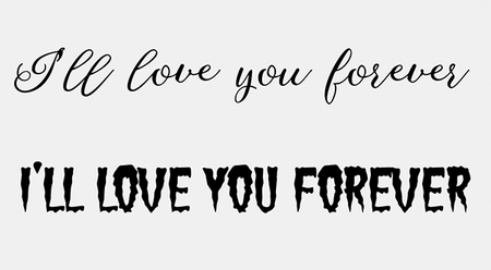
Typography is one of the most powerful aspects of visual design because depending on the typeface, the meaning of the words can change very quickly, like in figure 8.1. “I’ll love you forever” takes on a much more sinister meaning with the typeface on the bottom compared with the one on the top.