Back in chapter 1, we looked at the importance of maintaining a consistent UX throughout your app and across different platforms, and we touched on it again in chapter 5. Whether you strive for the “pixel perfect” approach or just want your app to feel like your app, wherever it is used, keeping your UI consistent is critical and helps users understand how your app works.
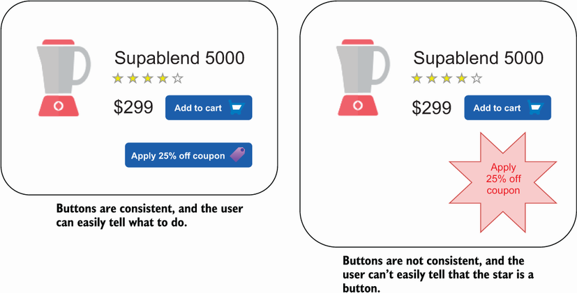
For example, using a primary and secondary color helps your users to understand the purpose of a button, as does using specific button shapes (for example, it’s common to use a circular floating action button to indicate an additive action). On the other hand, using too many different shaped or colored buttons could lead to confusion. Let’s see an extreme example in figure 10.1.
Figure 10.1 Two versions of an app UI. In both cases, a button is presented, which the user can tap to apply a 25% discount to their order. In the example on the left, the button looks like all the other buttons in the app, and the user can easily tell what to do. On the right, the button looks completely different, and it is not easy to tell that the star is a button that can be tapped.