Chapter 5. Polishing your app
This chapter covers
- Setting your application’s icon and start image
- Using images for buttons
- Customizing built-in views
- Animating view transitions
The flashcards app from the last chapter does what it needs to do, but without any style. Professional iPhone apps need to do better than that.
There are some things that Apple requires you to do, like making an application icon. Other things, such as transition animations, make your app look a lot more polished, and iPhone users will expect and appreciate them.
Pick up your phone right now, and start your favorite app: not necessarily the most useful one, but the one that gives you the best feeling when you use it. What do you notice? Professional iPhone apps have a polished look and professional graphic design and imagery, and they make extensive use of animations.
If you want to see apps from well- known designers, check out anything from Tapbots to Sophiestication. For example, here are two screenshots of Tapbot’s Weightbot.


And at right is the main screen of Sophiestication’s Groceries app.
The designers of these apps paid careful attention to the details, and the apps are top sellers in their competitive categories because of that work. It’s not just the colors and imagery. The designers also use animations to add life to their apps.
But don’t be overwhelmed. Each of these apps is built on a foundation of techniques that can be applied step by step. Once you understand how, you’ll only be limited by your imagination.

Every app needs to have an icon and a startup image. Because these are required, Apple made it easy to add them without any code, which should be a relief after the last chapter. Don’t worry: some fun chunks of code are coming later in this chapter, but right now you’ll get far with a little drag-and-drop.
The icon is the first thing users will see from your app, so it’s worth trying to make a good one. Most professional app icons are made by graphic designers, and if you can afford that or have a friend or coworker who can help, it will be worth it.
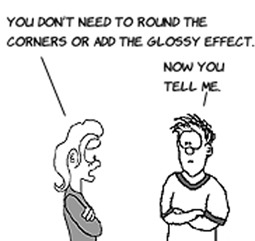
If you’re making an icon, keep in mind that you might need it in a lot of sizes, so either use software that lets you create vector images or design your icon at 512 x 512 to make sure you can reduce it to all the necessary sizes. Here’s what you’ll use for this app; note that the icon doesn’t have rounded corners or a glossy effect on it. The iPhone will add those for you.

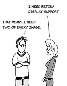
For now, you need the icon in two sizes. iPhones before 4.0 use 57 x 57 icons, but the retina display doubled the pixel density of the screen, so you need an icon at 114 x 114 for that. Name the first icon Icon.png and the second Icon@2x.png (the capital I is important).

Once you’ve created the icons, select your project in the Project Navigator and click FlashCards under TARGETS. Then select the Summary tab, if its not already selected, and scroll down to the App Icons section of the Summary page. Right-click the leftmost square that says No Image Specified, and choose Select File.

Select your 57 x 57 icon. Next, right-click the square labeled Retina Display, choose Select File, and select your 114 x 114 icon. When you select the icon files, they’re automatically copied into the project. If you’re a neat freak, move the icons files into the Resources group.

Run the app. When it starts, click the Home button so you can see the simulator’s home screen. There you’ll see the new icon being used for the app.

Good icons are memorable, distinctive, and well-crafted. They’re your first impression in the App Store and a constant reminder of your app on the phone once it’s installed. It’s worth being sure your app has a good one. Many icons have a prominent shape and a dominant color; both those things help them stand out in a crowd.
Having a great icon is just the start of polishing the look and feel of your application. To get the overall feel right, you need to make sure your application starts as quickly as possible. Professional iPhone apps seem to start instantaneously, and because you’re not doing much at the beginning of the FlashCards app, it’s weird that it seems to take longer. We’ll look at fixing that in the next section (hint: it’s a trick).
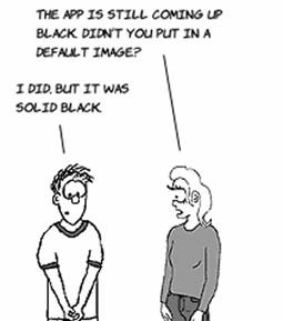
You might have noticed that when your app starts up, there’s a period of time when the screen looks black. If the app is a black hole simulator or a promotional vehicle for a Metallica, Spinal Tap, or Jay-Z album, then you can skip this section. If you need something different, read on.
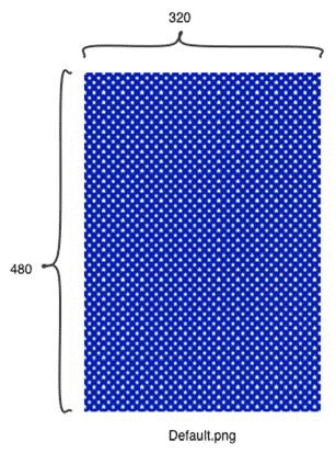
For the FlashCards app’s background, you’ll use a style similar to the icon and repeat a lot of small stars. If you’re not going to use the built-in iPhone backgrounds, stick to a simple, small repeating pattern or a naturally occurring surface like wood grain or brushed metal.

For the older iPhones, you need a 320 x 480 image called Default.png. For the retina display phones, you need one at 640 x 960 called Default@2x.png. And if that weren’t enough, for the iPhone 5, you need a 640 x 1136 image called Default-568h@2x.png.
Using these is just like using icons. In the Summary tab of FlashCards is a Launch Images section just below App Icons. Right-click each rectangle, and select the appropriate default image. When you’re done, move the added images into the Resources group to keep things neat.
You’ll want to incorporate this background into your app’s screens as well. To do that, open each XIB in Interface Builder and then add an image view to the view. Using the Attributes Inspector, set the image view’s image to Default.png. Size it correctly, and send it behind the other controls by clicking it and choosing Editor > Arrange > Send To Back from the menu.

As you can see, we also resized and positioned the title label. To make it semitransparent, we set its Alpha to 0.5 using the Attributes Inspector.
If you run the app, you’ll notice that it doesn’t start with a blank, black screen. When it comes up, it looks as shown at left.
The middle of the app’s start screen is blank and calling out for a graphic. The Default.png image should match whatever you decide to put there, but you still need a version of the image with blank space for the card views.

It’s also obvious that the buttons need an upgrade. The default no longer matches the new look. Now would be a good time to take a break and find a matching t-shirt as well.
Because your app uses a lot of buttons (six total), the easiest way to spruce it up is to make custom buttons. It would be nice to be able to reuse a background image for all of them, because you want consistency.

The easiest way to use an image for a button is to set its image in the Attributes Inspector. This is fine if you’ve made the exact button you want and aren’t going to change its size. A better way is to prepare a stretchable image and have the iPhone put the text on it for you. If you do that, you only need one image for all your buttons, and it will work no matter what the size or text.

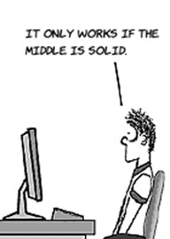
A stretchable image is an image that has a middle part that can be stretched and end caps that shouldn’t be altered when the image changes size. Here’s an example that shows how it works:

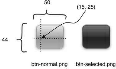
If you resize an image without doing anything, the edges are treated the same as the middle and look pixelated. To make an image stretchable, you need to know the width of the left cap and the height of the top cap.
Create two images with end caps that are the same size, one darker than the other. You’ll use the lighter one normally and the darker one when you’re touching the button. Name them as shown at right.
On the left is a better look at what would happen if you just resized an image to a wide button without doing this. For comparison, our stretchable button is on the right.

And you’re not limited to simple buttons. Anything with an area in the middle that can be resized and outer edges to preserve will work. At left is a button you could use in a dogtraining app.
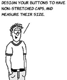
Using those guidelines, you can design images that can be used on every button in your app, no matter the size. They’ll also look great on the retina display without needing to alter them.

Once you have the buttons, you need a little code in order to use them in your app. Unfortunately, Interface Builder doesn’t have direct support for stretchable images.
The first step is to tell Interface Builder that you want to use a custom button style. Do this by selecting the buttons and setting their Type to Custom in the Attributes Inspector. Their background will be invisible, but you’ll still see them because of their text.

Next, create outlets for the buttons by opening the Assistant Editor and Ctrl-dragging into FCViewController.h. Call the outlets showStatesButton and showCapitalsButton. The Assistant Editor will create properties that look like this:
@property (weak, nonatomic) IBOutlet UIButton *showStatesButton;
@property (weak, nonatomic) IBOutlet UIButton *showCapitalsButton;
Now that you’re finished creating the Show States and Show Capitals buttons, open FCResultViewController.xib and create a Start Again button. Don’t forget to create an outlet named startAgainButton for the button, using the Assistant Editor.
Here’s how you code the stretchable buttons. Open FCAppDelegate.h, and add these message declarations:

- (void)setupButtonAsImage:(UIButton*) btn
               normalImage:(NSString*) normalImage
             selectedImage:(NSString*) selectedImage
                   leftCap:(NSInteger) leftCap
                    topCap:(NSInteger) topCap;

- (void)setupButtonAsImage:(UIButton*) btn
                     image:(NSString*) image
                  forState:(UIControlState) state
                   leftCap:(NSInteger) leftCap
                    topCap:(NSInteger) topCap;
Then, open FCAppDelegate.m, and add these messages.

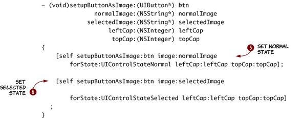
To use the images, first you need to copy them to your Resources folder. Then you can use the first message to load them  into a UIImage object by calling its imageNamed message. Once you load it, you send it a message
  to stretch it based on its left-cap width and top-cap height. Finally, you set the button’s background image
  and set the text of the button to white
  .
.
Each button needs this done twice—once for the normal state  and once for the selected state
  —so the next message does that. The second message uses the first and makes it easier for you, so you’ll be using it in your views.
In FCViewController.m, add #import "FCAppDelegate.h" to the import statements. Then you can call the new message by adding this code to the viewDidLoad message:
FCAppDelegate* delegate = [[UIApplication
                                    sharedApplication] delegate];
[delegate setupButtonAsImage:self.showStatesButton
                 normalImage:@"btn-normal.png"
               selectedImage:@"btn-selected.png"
                     leftCap:15 topCap:25];
[delegate setupButtonAsImage:self.showCapitalsButton
                 normalImage:@"btn-normal.png"
               selectedImage:@"btn-selected.png"
                     leftCap:15 topCap:25];
You can use similar code in all of your viewcontroller viewDidLoad messages. Run the app to see how it looks.
Isn’t that better? Well, it’s only as nice as your design, so be creative. We’ve emulated the Mac OS X aqua gel button look, but you’re free to make buttons with as radical a look as you want.
Icons, background images, color schemes, and buttons are a start, but to make your app stand out, you need to use animation. Without it, your app won’t seem as professional; with it, the app will appear to come to life.

If you play around with the built-in iPhone apps, you’ll notice that new views never snap into place. There’s always a little transition animation. It could be a slide, a flip, a page curl, or, with some apps, something even more fun. Good use of transition animations will make your app look more at home on the iPhone.
Probably the most common animation used on the iPhone has the next view slide into place. As you’ll see later, this animation is built into the navigation-based application template, but nearly every app with multiple views uses it somewhere.
Here’s what the FlashCards app will look with a push transition on the second view.

To do this, add #import <QuartzCore/QuartzCore.h> and these message declarations to FCAppDelegate.h:
-(void) pushView;
And add this code to the module file (pro tip: you can use Ctrl-Cmd-up arrow to switch between .h and .m files).

The CATransition class makes it easy to set up animations, and it’s used to animate an entire window. To use it, pick its type and subtype. Then set the duration in seconds . Finally, choose an animation curve to use as a timing function . That last part needs a little more explanation.
An animation sets up a background timing function that makes the changes to the window for you automatically. But it doesn’t need to apply an equal change at each point of the animation. In the code, you’re using an ease-in/ease-out animation, which will start slowly, speed up, and then slow down.


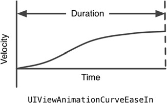
And, of course, you could reverse that or have no easing whatsoever by using different curves.
You use this animation by adding the following code to the end of the showCards message in FCViewController.m:
FCAppDelegate* delegate = [[UIApplication sharedApplication] delegate];
[delegate pushView];
Slide animations are all over the iPhone. You’re using a push, which means one view pushes the other out of the way. There are also reveals and move-ins, which you can see by changing the type of the transition to kCATransitionReveal or kCATransitionMoveIn.
The push animation is part of the QuartzCore framework; that’s why you had to import QuartzCore.h. In order to use the framework, you also have to add it to your project. Select the project in the Project Navigator, and click FlashCards under TARGETS. Make sure the Summary tab is selected, and scroll down to Linked Frameworks and Libraries. Click the plus sign to add the framework, and choose QuartzCore.Framework.

Another animation type you see a lot is a flip. Apps that consist of a single screen with settings sometimes use this animation to make it look like the settings are on the back of the view.
The code for a flip is similar to that of a push, but because flips can be applied to individual elements as well as the entire screen, you have to use UIView’s animation support instead of using CATransition directly. Add this message to FCAppDelegate.h:

-(void) flipView;
And here’s the message implementation for the .m file:
-(void) flipView
{
   [UIView beginAnimations:@"flip" context:nil];
   [UIView setAnimationTransition: UIViewAnimationTransitionFlipFromLeft
            forView:self.window cache:YES];

   [UIView setAnimationDuration: 0.5];
   [UIView setAnimationCurve:UIViewAnimationCurveEaseIn];

   [UIView commitAnimations];
}
The messages have the same meaning as their CATransition counterparts, with setAnimationCurve having the same meaning as setTimingFunction.
To call it, use this code in FCCardViewController.m, at the end of answerButtonTouched:
FCAppDelegate* delegate =
    [[UIApplication sharedApplication] delegate];
[delegate flipView];
Flips work well in this case because the app is emulating cards. It would be even better if you were showing the back of a card in the next view, because then the animation would be closer to the real-life version.
The only other things that don’t animate are the controls that appear when the app starts. This is more complex because you aren’t transitioning an entire view at once. Each part needs its own animation.
To use a custom animation, you use the UIView animation support; but instead of setting a type and a subtype, you start an animation, change the view, and then commit the animation. The iPhone will know to make the change using the animation. For example, if you wanted the Show States button to start offscreen (at y-position 460) and move to its final location at y-position 380, you’d use the steps shown at right.


If you choose an ease-in/ease-out curve, it will look like this:

To do that, add this message to FCViewController.m, above viewDidLoad.

You’ll use this code for the title and buttons. It remembers the passedin view’s position as set in Interface Builder . Then it sets a new starting position and starts an animation. In the animation, the code sets the original position as the final position so it looks like it does in Interface Builder at the end.
You can already call animateViewEntrance on the buttons because you have outlets. Before adding the next message, open FCViewController.nib and make an outlet for the title label called titleLabel by Ctrl-dragging into the Assistant Editor.

After you add the outlet, this code will compile:
-(void) animateViewLoad
{
    [self animateViewEntrance:self.showStatesButton
        startY:self.view.frame.size.height delay:0];
    [self animateViewEntrance:self.showCapitalsButton
        startY:self.view.frame.size.height delay:0];
    [self animateViewEntrance:self.titleLabel
        startY:-self.titleLabel.frame.size.height delay:0];
}
You call animateViewLoad in viewDidLoad by adding this code to the end of it:
[self animateViewLoad];
If you create and commit multiple animations, the iPhone runs them simultaneously:

It looks like this when you run it.

In animateViewLoad, you can see that you always use a delay of 0 seconds. If you want to delay the button’s appearence until after the title, set the delay to 0.5 for the buttons. It will use a timeline like this:

With overlapping delays and durations, you can have all kinds of animations. The best part is that you only need to provide starting and ending points, durations, and curves. You don’t need to update each inbetween state yourself.
Your icon, startup, overall look, and use of animations go a long way toward making an app look professional. Of course, it’s important that your app work, but no matter what it does, there are likely to be a few apps that do something similar. Professional-looking apps stand out in the crowded App Store, so it’s worth working with a graphic artist to get this right.

The last step is to make the app track data between runs. It’s likely that your users will want to know how well they have done over time. In the next chapter, you’ll learn about the iPhone’s support for data storage and presentation.