11 Refining user experience
This chapter covers
- Improving user experience by moving date and list pickers to modal dialogs
- Targeting multiple screen resolutions
In the last chapter, you learned how NativeScript themes can make your apps look more professional with a minimal amount of effort. Using the Pet Scrapbook as an example, we styled the home, scrapbook list, and update pages with the built-in light color scheme. Even though the app has started to look more professional, the UI and functionality of the update page is clunky.
In this chapter, you’ll learn how to create a cleaner and more concise UI by using modal dialogs. We’ll also tackle the problem of multiple screen sizes, and when we’re finished, we’ll have a great looking app for both phones and tablets. Let’s go!
11.1 Building professional UIs with modals
In chapter 10, you learned how to replace custom CSS styles with the built-in theme classes. We left off with the update page partially complete (figure 11.1).
Figure 11.1 The update page refactored to use theme classes.
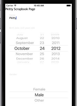
We think the update page is incomplete because the birth date picker and gender list picker take up too much room, creating a cluttered appearance. In mobile apps, appearance matters, so we’re going to build a more professional UI by using modal dialogs.