6 Using advanced layouts
This chapter covers
- How to organize your app user interface (UI) with the grid layout
- How layout containers can be nested underneath each other to make more advanced UI designs
- How a grid layout can be used to create uniformly-sized rows and columns
- The three different ways in which you can specify the size (width and height) of grid layout rows and columns
In Chapter 5, you learned about the stack layout and how it allows you to stack UI components on top of each other. This layout is a foundational layout container that will appear every app you write; however, it is limited. In this chapter, you will be introduced to an additional layout: the grid layout. After you’ve learned about the grid layout, you’ll be able to construct more advanced and complex UI designs. In fact, with just the stack and grid layouts, you’ll be able to create pretty much any UI. That may seem to be a stretch, but in our experience, we’ve been able to construct about 95% of our app layouts by using these two layouts.
6.1 Introducing the grid layout
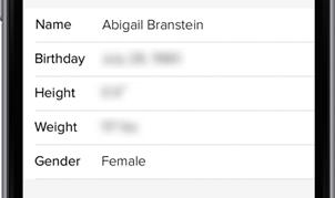
Imagine you are developing a mobile app with a series of labels and text fields arranged in a series of rows and column. The profile page in figure 6.1 shows an example of one such UI.
Figure 6.1 A mobile app profile page with labels and textboxes organized in rows and columns.