Chapter 1. Learning to work responsively
This chapter covers
- An overview of a responsive workflow
- Using a prototype to communicate responsive design
- Building a simple responsive website
As the web has evolved, we’ve learned new tactics. We’ve established new ways of working and added them to our older ways. Responsive web design has given us a whole new set of skills to add to our workflow. But before we can start discussing those skills, we need to answer a simple question. What exactly is “the responsive web”?
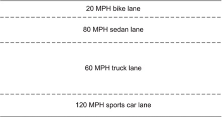
Remember when people called the internet the “information superhighway”? It sounds cheesy now, but imagine that “superhighway.” Right now it’s full of people in sports cars, 18-wheelers, bicycles, family sedans, racecars, and pickup trucks. Some travel at hundreds of miles an hour; others go at a snail’s pace. Some legs of the highway have bike lanes, sedan lanes, and fast lanes, as illustrated in figure 1.1. Every once in a while, a traveler gets confused, and a sports car ends up in the bike lane, and a bike ends up in the sedan lane.