10 Styling forms


This chapter covers

  • Styling input fields
  • Styling radio buttons and check boxes
  • Styling drop-down menus
  • Considering accessibility
  • Comparing :focus and :focus-visible
  • Using the :where and :is pseudo-classes
  • Working with the accent-color property

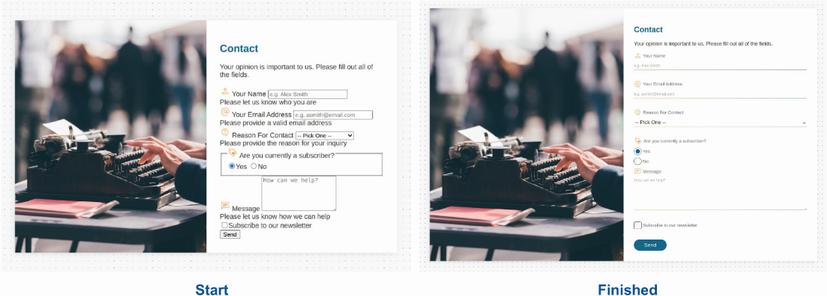
Forms are everywhere in our applications. Whether they’re contact forms or login screens, whether or not they’re core to an application’s functionality, they’re truly omnipresent. The design of a form, however, can easily make or break the user’s experience. In this chapter, we’ll style a form and look at some of the accessibility considerations we need to make sure to address. We’ll look at some of the challenges that come with styling some radio and check-box inputs and drop-down menus, and we’ll cover some options for styling error messaging.

A form in this context is a section of code in an HTML <form> element containing controls (form fields) that the user interacts with to submit data to a website or application. Because contact forms are so prevalent across applications and websites, we’ll use a contact form as the basis for our project.

10.1 Setting up

Our form contains two input fields, a drop-down menu, radio buttons, a check box, and a text area. We also have a header at the top and a Send button at the end of the form. Figure 10.1 shows our starting point—the raw HTML without any styles applied—and what we aim to accomplish.

Figure 10.1 Starting point and finished product

10.2 Resetting fieldset styles

10.3 Styling input fields

10.3.1 Styling text and email inputs

10.3.2 Making selects and textareas match the input styles

10.3.3 Styling radio inputs and check boxes

10.3.4 Using the :where() and :is() pseudo-classes

10.3.5 Styling selected radio and checkbox inputs

10.3.6 Using the :checked pseudo-class

10.3.7  Shaping the selected radio buttons’ inner disk