concept item in category ember

This is an excerpt from Manning's book Ember.js in Action.
For example, when you browse an online store, you search for items to add to your shopping cart. When you add an item to the cart, you reasonably expect the item quantity and the shopping cart summary to update simultaneously. This lets you know the total number of items as well as the total price of the items in your shopping cart.
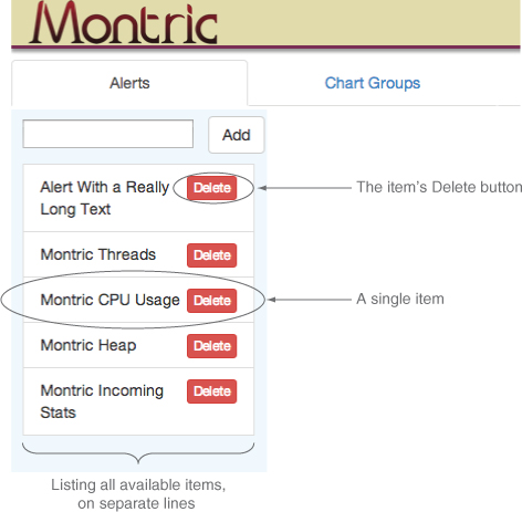
The selectable-list component works as a list from which the user can select an item. In addition to selecting an item, the user can delete an item via a handy Delete button.
The component displays a list of items, and each item appears in a separate row. The component, with no item selected, is shown in figure 7.2.
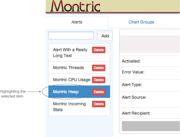
When the user clicks a row with the mouse, you want to highlight the selected row. The component with an item selected is shown in figure 7.3.
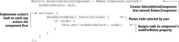
Note that you give the delete-modal an id as well as an item. You haven’t seen the nodeForDelete property yet, but when you implement the action showDeleteModal for the selectable-list component, you’ll see where this property comes from. The following listing shows the new Montric.SelectableListComponent.
You now see where the nodeForDelete property comes from. Whenever the user clicks the Delete button of a node, the selectable-list-item’s showDeleteModal action is triggered. This, in turn, fires the showDeleteModal action on the selectable-list component, setting the node the user wanted to delete in the selectable-list component’s nodeForDelete property. Because the nodeForDelete property is passed in and bound to the delete-modal component’s item property, the modal panel can show the user which item will be deleted when the Delete button is clicked. The deleteItem action of the delete-modal component deletes the item and closes the modal panel.