concept glyph in category itext

This is an excerpt from Manning's book iText in Action, Second Edition.
Characters in a file are rendered on screen or on paper as glyphs. ISO-32000-1, section 9.2.1, states: “A character is an abstract symbol, whereas a glyph is a specific graphical rendering of a character. For example: The glyphs A, A, and A are renderings of the abstract ‘A’ character. Glyphs are organized into fonts. A font defines glyphs for a particular character set.”
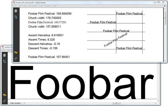
You can change the width of a Chunk with the setScaling() method. In the top right of figure 3.8, the words “Foobar Film Festival” are scaled to 50 percent of their width, but the height of the glyphs is preserved. This means that the aspect ratio of the letters is changed. You have to be careful not to exaggerate the scaling. At some point, your text will become almost illegible.
The setSkew() method expects two parameters. With the first parameter, you change the angle of the baseline. That’s what happened in the second line on the right side of figure 3.8: the angle of the baseline is changed to 15 degrees. The second parameter can be used to define the angle between the characters and the baseline. The third line on the right in figure 3.8 looks as if an italic font were used. In reality, the glyphs were skewed 25 degrees.
You can calculate the length of a String if you have an instance of the BaseFont class that will be used to draw the glyphs. In listing 3.7, you’ll measure the length of the String “Foobar Film Festival” using the getWidthPoint() method. This will return a width in points. For example, when you use the getWidthPoint() method with the font Helvetica and a font size of 12 pt, the resulting length is 108.684 pt. When you use the font program times.ttf with the same font size, the result is 100.572 pt. That’s a difference of 0.11 in.
Looking at figure 3.7, you might assume that the font size is about 9 pt, but you would be wrong. The ascent for the String in Helvetica is 8.328. You need to add the descent to the ascent, but the value of the descent is unusually low in this example because it doesn’t include glyphs like “g”, “j”, “p”, “q”, or “y”, which have a descent that exceeds –0.18.
The word “Foobar” is magnified so you can see the descent caused by the rounding of the glyphs “o”, “b”, and “a”. In the same screenshot, you can see that the same String was added a couple of times more, at absolute positions relative to a grid of lines.