concept theme in category node

This is an excerpt from Manning's book Next.js in Action.
Themes are a common use case for supporting dynamic styles. Often, the app you’re building will need to support subtle visual differences from one deployment to the next. Instead of major design changes, you can tweak theme values, leaving the style implementation alone.
Figure 5.9: Components on a page, styled using dynamic theme values passed in as props
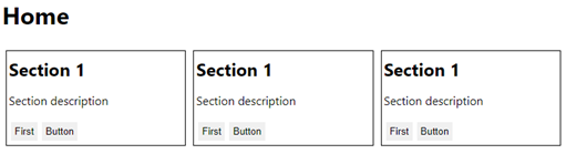
Let’s walk through two similar approaches to supporting themes in Next.js apps. First, we’ll create an object to store our theme values:
Listing 5.15: A page component with a theme object
export default function MyPage() {
  const theme = {
    fontFamily: `-apple-system, BlinkMacSystemFont, "Segoe UI", Roboto,
      "Helvetica Neue", Arial, Noto Sans, sans-serif, "Apple Color Emoji",
      "Segoe UI Emoji", "Segoe UI Symbol", "Noto Color Emoji"`,
    contentDirection: "row",
    section: {
      headingMargin: "5px",
      width: "300px",
      border: "solid 1px",
      margin: "5px",
      padding: "3px"
    },
    button: {
      margin: "3px",
      padding: "5px",
      borderStyle: "none"
    }
  };

  return (
    ...
  );
}
In terms of how we would want to scope these styles when they’re applied to Next.js pages, the fontFamily property is global while the contentDirection property targets the layout of the page. The two nested objects in our theme – section and button – each target specific components used by pages in the app. Let’s look at the Layout component used by this page:
Listing 5.16: A Layout component that takes a theme property to apply dynamic styles
function Layout({ title, children, theme }) {
  return (
    <div class="root">
      <h1>{title}</h1>
      <main>{children}</main>
      <style jsx global>{`
        body {
          font-family: ${theme.fontFamily};
        }
      `}</style>
      <style jsx>{`
        main {
          display: flex;
          flex-direction: ${theme.contentDirection};
        }
      `}</style>
    </div>
  );
}
The structure of this layout includes an <h1> element for the page title and a <main> element for the content of the page. There are two styles defined here. The first is global since it applies styles to the <body> element. Specifically, the font-family style comes from the theme object that we’ve created: theme.fontFamily. The theme itself is passed to Layout via the theme property. The next style isn’t global because it only applies to elements of this component. This is where the contentDirection value is used and determines the flex-direction of the content inside the <main> element. Next, let’s look at the Section component:
Listing 5.17: A Section component that takes a theme property
function Section({ title, children, theme }) {
  return (
    <section>
      <h2>{title}</h2>
      {children}
      <style jsx>{`
        h2 {
          margin-top: ${theme.section.headingMargin};
          margin-bottom: ${theme.section.headingMargin};
        }
        section {
          width: ${theme.section.width};
          border: ${theme.section.border};
          margin: ${theme.section.margin};
          padding: ${theme.section.padding};
        }
      `}</style>
    </section>
  );
}
The styles in Section get their dynamic values using the same approach as Layout, by accepting a theme property where we can pass in our theme object. The values used by this component all come from theme.section, which makes it easier to keep track of where theme values are used. The last component used on this page is Button, which we’ll look at now:
Listing 5.18: A Button component that accepts a theme property value
function Button({ children, className, theme }) {
  return (
    <Fragment>
      <button className={className}>{children}</button>
      <style jsx>{`
        button {
          margin: ${theme.button.margin};
          padding: ${theme.button.padding};
          border-style: ${theme.button.borderStyle};
        }
      `}</style>
    </Fragment>
  );
}
Like the Section component, Button takes a theme property and uses values from theme.button to dynamically build styles. Now we’re ready to put our page together:
This is an excerpt from Manning's book Getting MEAN with Mongo, Express, Angular, and Node.js 2ED.
Bootstrap is a front-end framework that provides a wealth of help for creating a great user interface. Among its features, Bootstrap provides a responsive grid system, default styles for many interface components, and the ability to change the visual appearance with themes.