When someone needs to submit a form, use a button—not a link. Links take people to resources; buttons trigger actions. That distinction helps assistive technology communicate what a control does. section 5.4
The native HTML <button> supplies behavior that a clickable <div> does not: it enters the Tab sequence, shows a focus indicator by default, and responds to Enter and Space. It also exposes a button role and can take its accessible name from its text. Pointer activation occurs on release, so moving away before release can cancel an unintended click. Recreating these behaviors in a <div> takes extra work and risks bugs. section 2.5 section 6.1.3
Submit and clear a form
Use <button type="submit"> for the primary submission action and <button type="reset"> for “Clear all fields.” Give each a clear label, distinguish the actions visually, and provide associated guidance when clearing data needs a warning. TIP: Include reset only when it adds value: activating it removes all entered data. section 6.1.10
Figure 6.9 Native <button> elements are used, with clear labels that describe each action. Primary and secondary actions are visually distinguished, while the “Clear all fields” button includes additional guidance programmatically associated via aria-describedby.
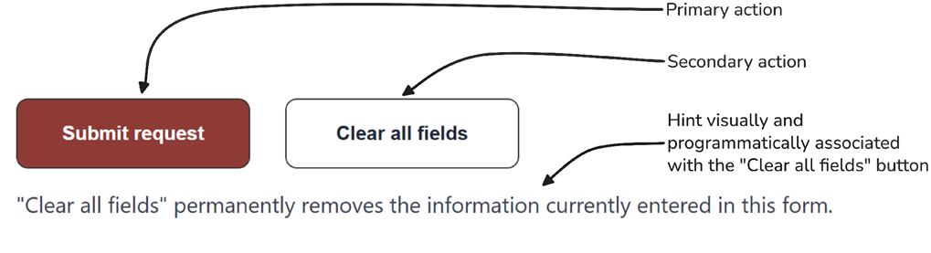
The form illustration shows native buttons with clear action labels, distinct primary and secondary styling, and guidance associated with the clear action. section 6.1.10
Prefer the native control when an interface calls for an action. It gives keyboard, pointer, and assistive-technology users expected behavior without making the team maintain a custom substitute. section 2.5 section 6.1.3