Color blindness, also called color vision deficiency, means some colors are harder to distinguish. It matters whenever color carries information: two marks that look clearly different to one viewer may look alike to another. Approximately 1 in 12 males and 1 in 200 females live with some form of it. section 4.1.4 section 4.4.1
Color perception depends on three kinds of cone cells, most sensitive to short, medium, or long wavelengths of light. If one kind does not function, the result is dichromacy; if a cone’s sensitivity is shifted or weaker, it is an anomalous form of color vision. Deuteranomaly, in which green-sensitive cones shift toward red, is the most common type. Color blindness does not necessarily mean seeing only black and white. section 4.1.4
The traffic-light trap
A red–yellow–green heatmap may seem to say “needs attention, in between, fine.” But red and green can be difficult to tell apart with red- or green-cone deficiencies. An orange–gray–blue palette makes the differences easier to see in the illustrated simulations. If traffic-light colors are required, separate red from green with space, a border, or another color; choose noticeably different lightness levels; and avoid many shades of each. section 4.4.1
Figure 4.33 The top row shows a classic traffic light palette applied to a heatmap and what it looks like to someone with deuteranomaly (center) and deuteranopia (right). The bottom row shows a more colorblind-friendly palette of orange, gray, and blue instead of red, yellow, and green, respectively, under the same simulations. Remember, deuteranomaly is the most common type of color blindness, where the peak absorption of the green cone shifts toward the red end of the spectrum making greens appear more red. Deuteranopia is when the green cone isn’t functional at all.
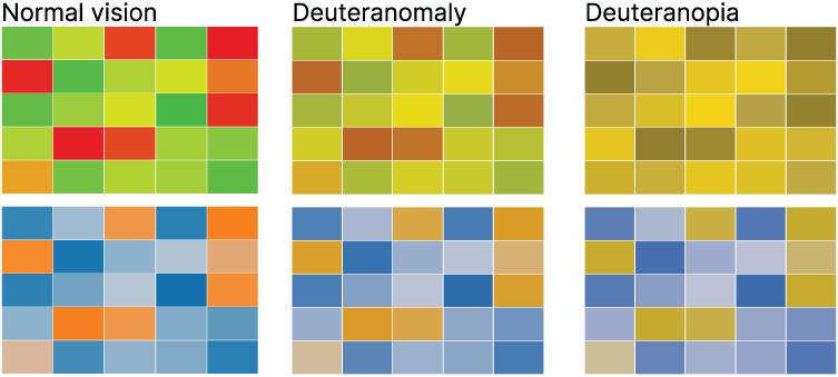
Compare the traffic-light and orange–gray–blue heatmaps under approximate deuteranomaly and deuteranopia simulations. The comparison makes a palette choice visible rather than merely naming one. section 4.4.1
Check palettes in context, not just as attractive swatches. In a categorical palette, orange and red might become too similar for someone with red blindness; adjust colors before assigning them to data. For a continuous scale, vary lightness as well as saturation or hue so values remain distinguishable in grayscale. Check contrast against the background, too. Desktop filters and browser plugins can approximate different deficiencies, but their views are approximations, not a substitute for careful palette choices. section 4.3.3 section 4.3.1 section 4.4.1