Supplementary help should remain usable for people who need to move a pointer onto it or navigate with a keyboard. Custom tooltips and similar content must be dismissible, hoverable, persistent, and keyboard accessible—not dependent on hover alone. section 6.6
For a tooltip or similar content:
- Allow dismissal without moving the pointer or keyboard focus; Escape is one example. section 6.6
- Let users move the pointer onto the content without making it disappear. section 6.6
- Keep it visible until dismissed, the pointer or focus moves away, or the information is no longer valid. section 6.6
Figure 6.15 Tooltip control, showing supplementary information about an input field using an icon button trigger.
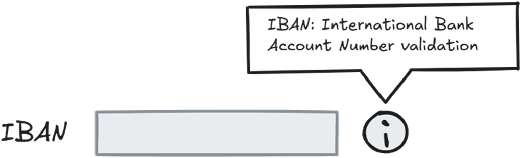
The tooltip example uses an icon button to reveal supplementary information about an input field. section 6.6
The HTML Popover API’s popover="hint" provides some behavior, including Escape dismissal; other requirements still need appropriate handling. section 6.6
