A keyboard user can lose their place when focus jumps unexpectedly, follows a confusing order, or slips behind an open dialog. Focus management keeps movement predictable: put focus where the current task begins, keep it within the active interaction when needed, and return it to a useful place afterward. section 5.3.2
Start with the HTML document order. In a payment form, place “Proceed to Payment” before “Back to Search” when that is the logical task order; use CSS for visual placement. Check that the resulting Tab sequence still makes sense. Avoid positive tabindex values to force a custom order: they are difficult to maintain. section 5.3.2
When a modal dialog opens
Move focus into the dialog. A short confirmation might start at its primary action; a dialog with important introductory information might start at its heading or container. While it is open, Tab and Shift+Tab should cycle within the dialog, not reach background controls. On dismissal, return focus to the opener. If that element no longer exists, choose the next logical place instead of sending the user to the top of the page. section 5.3.2
Figure 5.8 In modal dialogs, keyboard focus should remain inside the dialog until it is dismissed, rather than moving to background content.
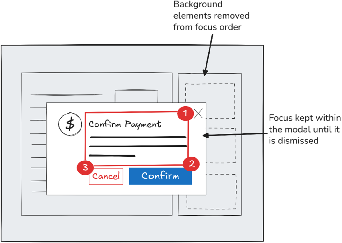
The diagram makes the dialog boundary concrete: keyboard focus stays inside the active dialog rather than moving to background content. section 5.3.2
Custom tabs need more than ARIA labels. Their keyboard behavior and focus movement must work too: the tab example moves focus with arrow keys and updates which tab participates in the Tab sequence. Use the WAI-ARIA Authoring Practices Guide for expected component behavior, then test with a keyboard and screen reader. Do not assume a component library has handled this correctly. section 2.5.2
