A meaningful icon, chart line, or other graphical element can disappear when it lacks contrast with its background. Keep meaningful graphics and interactive components—including their borders, focus indicators, and states—clearly distinguishable so users can perceive and interpret them. section 3.1.3
When reviewing a graphical element:
- Check that it stands out from its background; for an icon, also check that its symbol stands out from its fill. section 3.1.3
- Do not rely on a different line style alone to make a chart series perceptible if its contrast is insufficient. section 3.1.3
- Inactive components and purely decorative elements are among the stated exceptions to non-text contrast requirements; clarity remains a practical goal. section 3.1.3
Figure 3.9 This image shows a line graph with two data series. The top series (solid) has sufficient contrast against the graph background, while the second series does not. Although the two series are differentiated using different line styles, the dotted line lacks sufficient contrast and is therefore difficult to perceive.
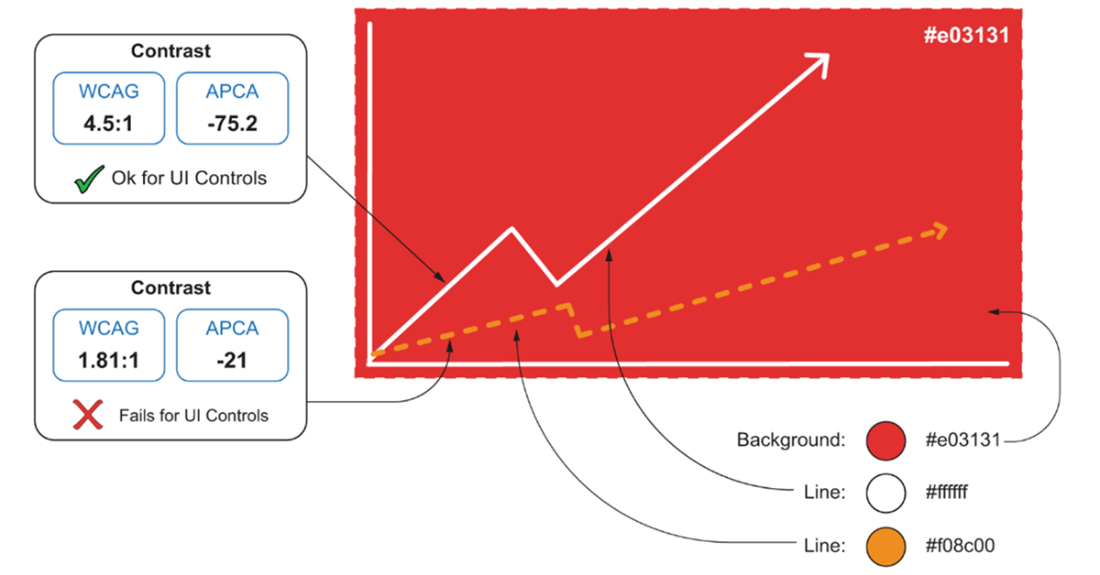
Compare the two graph series: a different line style does not make the low-contrast dotted series easy to perceive. section 3.1.3