A letterform is the visible shape of a written character. The same character can take different forms—lowercase a and g, for example—while keeping its meaning. Those small shape choices are not merely decorative: they affect whether text feels easy to read and what personality it projects. section 5.3 section 5.2.1
At small sizes, judge letterforms as part of the balance between ink and white space. Counters—the spaces inside closed or partly closed letters—matter to readability; rounder counters are generally easier to read. Also favor typefaces whose easily confused characters remain visibly distinct, especially in labels, annotations, and other compact visualization text. section 5.2.1
When choosing letterforms, look for two jobs at once:
- Readability: use shapes with enough internal space and clear distinctions when text will be small. section 5.2.1
- Tone: notice how stroke weight, edge shape, rounding, and proportions change the impression before anyone reads the words. section 5.3
- Fit: match the visual voice to the content. A Shakespearean sonnet can feel more at home in a serif face, while squared, heavy, untapered forms can feel solid, modern, and impersonal. section 5.3
Rounded versus squared forms
A rounded sans serif can suggest balloons and feel friendly and open. A sans serif with squared, non-tapering edges can instead feel colder, more impersonal, or more modern. Neither is automatically better; the useful question is whether that feeling supports the message. section 5.3
Figure 5.20 You learned at an early age that some letters can be drawn differently and yet still have the same meaning, like lowercase a and g. Futura uses the single-story variant, while Lato uses the double-story variant.

Compare the single-story and double-story a and g to see how recognizably different shapes can represent the same letters. section 5.3
Figure 5.21 The subtle differences in each of six fonts can be seen plainly when zoomed way in on a single word. How these differences pan out on a block of text can be seen in the paragraph to the right of each enlarged sample. (From Shakespeare’s Sonnet 116, public domain)
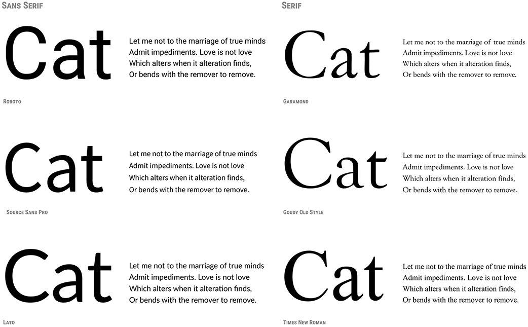
Use the enlarged samples and paragraphs to connect subtle letterform differences with their effect across a block of text. section 5.3
