A logical property describes an element through its inline and block directions instead of fixed top, right, bottom, left, width, or height values. This lets the same layout adapt to right-to-left and vertical writing modes. section 3.1.2
The browser interprets inline direction as the text flow and block direction as the direction in which boxes stack. Thus, inline-size behaves like width in horizontal writing and like height in vertical writing. section 3.1.2
Common physical properties map to writing-mode-aware alternatives:
- width becomes inline-size, and height becomes block-size. section 3.1.2
- padding-left and padding-right become padding-inline-start and padding-inline-end. section 3.1.2
- border-top and border-bottom become border-block-start and border-block-end. section 3.1.2
- margin-inline, margin-block, padding-inline, padding-block, border-inline, and border-block provide useful paired-value shorthands. section 3.1.3
A direction-aware container
.container { max-inline-size: var(--column-width); margin-inline: auto; } This preserves the centered double-container pattern while expressing its maximum measure and side margins logically. In a horizontal writing mode it looks unchanged; other writing modes can reinterpret the dimensions and sides. section 3.1.3
Figure 3.5 Inline and block directions in various writing modes
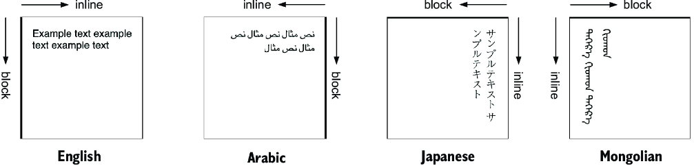
Compare inline and block directions across horizontal, right-to-left, and vertical writing modes. section 3.1.2