Playfair Display is a serif typeface suited to large headings. Its generous counters and x-height support readability, while its high stroke contrast adds visual drama. section 20.3
When pairing Playfair Display with another typeface:
- Use Open Sans for body text to contrast the heading typeface with a sturdy sans serif. section 20.3
- Check counters, apertures, x-height, stroke contrast, and available regular, italic, and bold fonts. section 20.3
- Add Georgia as a fallback so the browser has a system serif while web fonts load. section 20.3
A heading font stack
Link Playfair Display’s bold and bold italic fonts through Google Fonts, then declare: font-family: "Playfair Display", Georgia, serif; section 20.3
Figure 20.2 When deciding on a typeface that will render well even on small displays, look for larger counters and apertures, good x-height, and low stroke contrast.
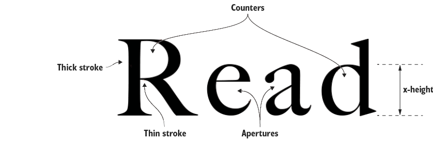
Compare counters, apertures, x-height, and stroke contrast when judging typefaces for small displays. section 20.3