The rule of three finds an unknown quantity from two equivalent proportions. If A corresponds to B and C corresponds to X, calculate X as B × C ÷ A. section 10.2.1
Scaling responsive chart labels
A 15 px label in a 1,200 px SVG container would scale to about 4 px in a 315 px container: 315 × 15 ÷ 1,200 ≈ 4. To preserve a visual 15 px appearance on phones, calculate 15 × 1,200 ÷ 315 ≈ 57 px, then use a clamped linear scale to resize labels dynamically. section 10.2.1
Figure 10.5 Because the viewBox attribute of the SVG container is set and its width and height attributes are not, all the graphical elements resize with the screen. If the font size of the axis label is set to 15 px, they will look much smaller on phone screens. We can use a rule of three to find the actual font size that we need to apply on phone screens.
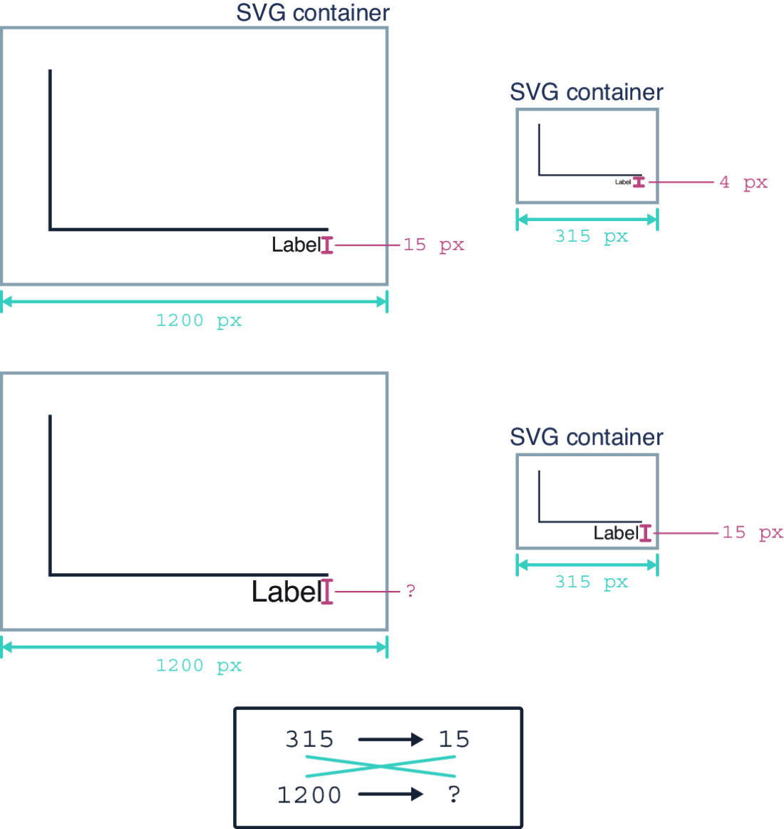
Shows why SVG axis labels become visually tiny on phone screens and how the rule of three helps determine their responsive size. section 10.2.1