A slab serif is a serif classification with substantial, block-like serifs. It often feels friendlier and bolder than more formal serif styles. section 8.2.2 section 8.2.6
Use a slab serif by making its role and contrast deliberate:
- Set slab serif headings against sans-serif body copy, as with Roboto Slab and Roboto. section 8.2.2
- Choose enough difference in size and weight to make the content hierarchy clear. section 8.2.2
- Check the typeface’s mood and test spacing for readability before settling on the design. section 8.2.6
A friendly, bold heading
Museo Slab can make a design feel friendlier and bolder than a more formal serif. Roboto Slab paired with Roboto applies the same contrast to a headline-and-body combination. section 8.2.2 section 8.2.6
Figure 8.13 Roboto Slab and Roboto are two typefaces from the same superfamily, Roboto, and pair well together.
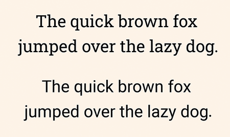
Compare Roboto Slab and Roboto as coordinated headline and body typefaces from one superfamily. section 8.2.2