Vertical rhythm is a spacing system that gives a page a steady visual beat. It starts with a baseline and uses that unit to coordinate line height, margins, padding, and type sizes. Rather than choosing each gap independently, use related values so headings, paragraphs, images, and interface components feel like they belong to one layout. section 8.2.5 section 8.3
This regularity does more than make a page look tidy. Spacing defines relationships: a larger gap before a heading can signal a new content section, while a smaller gap between a subheading and subtitle shows that they belong together. A consistent rhythm gives readers clearer visual cues as they move through content. section 8.3 section 10.5
Build a vertical rhythm from a few connected decisions:
- Choose a base font size and a baseline unit. A 16px body size with 1.5 line height produces a 24px rhythm unit; a 4pt grid can instead support smaller incremental spacing choices. section 8.2.5 section 10.4
- Set readable body line height first. A 1.5em value is a common starting point and meets the WCAG 2.1 minimum cited for main paragraph text, but test it with the selected typeface and line length. section 8.2.5 section 10.5
- Use the baseline or its multiples to calculate margins and padding. This keeps text and surrounding elements aligned even when their font sizes differ. section 8.2.5 section 10.10
- Tighten multiline headings when needed. Large headings often work better around 120% to 140% line height than at the more open paragraph setting. section 8.2.5
- Adjust surrounding space after changing line height. A type change can break grid alignment, so compensate with margins or padding that restore the intended rhythm. section 8.2.5 section 10.5
A 12px baseline with a simple type ramp
Start with a 12px baseline on a 4pt grid and body copy at 16px. A body line height of 1.25 gives 20px, which does not land on the 12px baseline by itself. Add 16px above a paragraph so the combined vertical measure reaches 36px, a multiple of 12. Then give H1, H2, H3, and paragraph styles distinct line heights and top margins, using more space above subheadings to mark new sections. section 10.5
Vertical rhythm is a guide, not a substitute for judgment. There is no single perfect line height: font choice, heading size, and line length affect readability. Begin with a consistent unit, inspect the rendered page, and refine gaps when the content feels too loose, too cramped, or unclear in its grouping. section 10.5 section 8.3
Figure 10.3 Our baseline for typography is 12px and doesn’t change at all. This baseline will establish our vertical rhythm and influence margin and padding for the rest of the UI components.
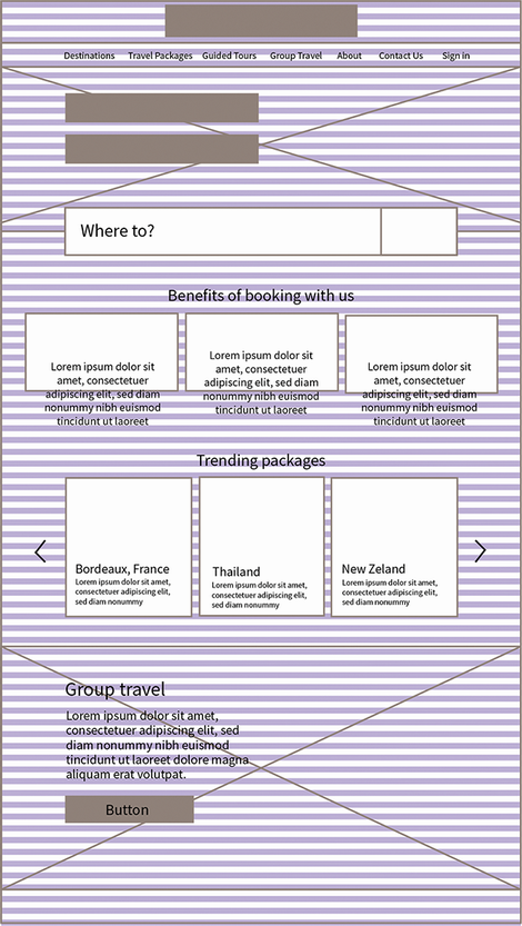
Use the baseline diagram to see how one fixed unit can guide typography and component spacing across a page. section 10.5