Yellow is a warm-spectrum hue that attracts attention through high visibility. It can suggest positivity, optimism, amusement, and happiness, while also signaling caution or warning. section 9.3
Use yellow deliberately in interfaces: it can focus attention, especially against a darker color, but excessive or overly bright yellow may feel overwhelming or unpleasant. section 9.3
Practical decisions for using yellow include:
- Choose a muted or golden yellow when the design needs an accent that attracts attention without becoming harsh. section 10.7
- Pair yellow with a complementary blue and use contrast to guide the eye toward important interface elements. section 10.7
- Reserve yellow for focused UI elements rather than applying it broadly to image-heavy backgrounds. section 10.7
Travel website accent
A travel website uses muted blue for its brand areas and golden yellow for the search button, Trending Packages card, and Group Travel button. These accents lead attention through the page. section 10.7
Figure 10.13 After defining our color palette, we can use our palette to bring more hierarchy to the page. The gold accent color highlights the areas we want users to focus on and draws them down the page.
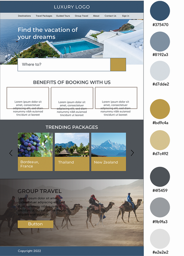
The figure shows how a gold accent color creates hierarchy and directs users toward selected areas of a page. section 10.7