chapter eleven
This chapter covers
- Building a brand-new component and refreshing our memories about what we’ve learned so far, including the Shadow DOM, modules, the Custom Element API, and reflection
- Breaking a design into multiple components and focusing on component reusability to use a single, smaller component for a dual purpose in a bigger context
- Using the MutationObserver feature to watch for attribute changes
- Event bubbling inside your component
- Component best practices as related to switching between using the Shadow DOM or not
- Using consistent and universal design rules provided by CSS vars and importable CSS modules
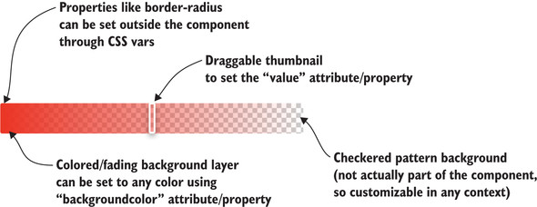
Now is a great time to step back and take stock of everything we’ve learned. We’ve done lots with Web Components throughout this book. At the same time, there haven’t been many great examples of UI components that are good to share. One example of a UI component that we have been working on is the slider component.
Figure 11.1 gives a quick reminder of what that slider is capable of. This slider component has been built from the beginning with the intention of sharing and using it in a larger context. It is a bit of a simple component, so using it as a small piece of a larger, more useful and shareable UI component is a great next step!
