Text can meet a contrast threshold and still be difficult to read. The Advanced Perceptual Contrast Algorithm (APCA) helps designers assess how clearly foreground content stands out against its background, with greater attention to human visual perception than a contrast ratio alone. section 3.1.1 section 3.5
APCA expresses contrast as a Lightness Contrast (Lc) value. Its assessment accounts for color, text size, font type, weight, and polarity—whether the design uses dark text on a light background or the reverse. That makes it useful when judging a specific text treatment, rather than relying only on the foreground and background colors. section 3.5
Figure 3.2 Example of contrast calculation using both WCAG contrast ratios and APCA. The WCAG contrast ratio (4.5:1) is sufficient, but according to APCA, the Lc score (71.6) is insufficient, as the contrast for body text should be at least 75.
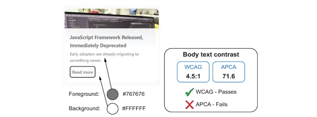
Compare the same color pairing under both models: its WCAG ratio is 4.5:1, but its APCA score is Lc 71.6, below the figure’s Lc 75 target for body text. section 3.1.1
TIP: Use APCA to refine design decisions, not to replace a required WCAG contrast check. WCAG ratios remain the conformance baseline under WCAG 2.1, WCAG 2.2, and standards that reference them. When the two assessments differ, ask whether the chosen text size, weight, or color pairing needs improvement for readers. section 3.1.1 section 3.5