A faint input border can make a form field hard to find, especially for someone with low vision. Lightness Contrast (Lc) is APCA’s measure of how clearly a foreground color stands out from its background. It offers a perception-based way to assess contrast during design. section 3.1.3 section 3.5
Lc is not a WCAG contrast ratio. WCAG uses a ratio based on relative luminance; APCA also considers factors such as text size, font, weight, and whether text is dark on light or light on dark. Use Lc to inform design decisions, but use the applicable WCAG ratio to check conformance. section 3.1.1 section 3.5
A passing ratio may still warrant a closer look
One body-text color pair reaches a WCAG ratio of 4.5:1, yet its APCA score is Lc 71.6—below the illustrated body-text target of 75. The two measures can therefore lead to different design judgments. section 3.1.1
Figure 3.2 Example of contrast calculation using both WCAG contrast ratios and APCA. The WCAG contrast ratio (4.5:1) is sufficient, but according to APCA, the Lc score (71.6) is insufficient, as the contrast for body text should be at least 75.
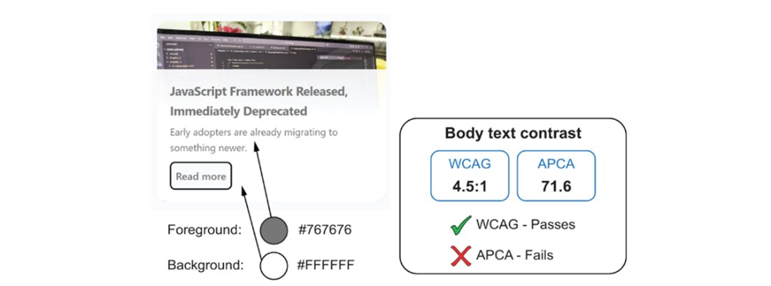
Compare the WCAG ratio and Lc score for the same foreground and background colors. section 3.1.1
TIP: Check more than text. For UI components and meaningful graphics, an APCA Lc value of 60 or higher is offered as a practical contrast guide. Inspect borders, icons, selected states, and chart lines against their immediate surroundings; a visible component is easier to recognize and use. section 3.1.3