If an alert fades into its background, someone may miss it entirely. A person with low vision may need to zoom, slow down, or strain to read it; bright sunlight or a small screen can make the same design harder for anyone. Sufficient contrast means text and meaningful interface elements stand out enough from their backgrounds to be seen and used. section 3.1
Check what people need to read, recognize, and act on:
- Keep body text, links, labels, hints, and error messages readable against their backgrounds. Meeting a minimum contrast ratio does not guarantee comfortable reading: thin type or small screens may call for more contrast. Aim for sufficient contrast, not the highest possible contrast. section 3.1.2 section 6.1.10
- Make controls and their states visible, including input outlines, selected checkboxes, icons, and keyboard focus indicators. Check both an icon’s symbol against its fill and the icon as a whole against its surroundings. section 3.1.3
- Keep meaningful chart lines and other graphics distinguishable. Do not rely on a different line style if a line still disappears against the chart background. section 3.1.3
A link that looks fine until the layout changes
Navigation links may be readable over one part of a gradient but shift onto a lighter part on a narrow screen. Test the actual layout at different viewport widths, at 200% and 400% zoom, and in portrait and landscape where supported. Prefer a predictable background that keeps the links visible as the layout moves. Browser responsive modes can help with these checks. section 3.1.4
Figure 3.10 This image shows a section of a page as rendered on a mobile device. The left side shows the default rendering, while the right side illustrates how it may appear to people with reduced contrast sensitivity. The navigation area uses a gradient background, and on smaller screens, some links shift onto a lighter portion of it, where they no longer have sufficient contrast.
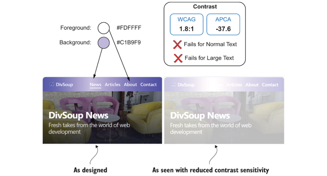
The mobile gradient example shows why checking a color pairing in isolation is not enough: moving links can end up over a lower-contrast area. section 3.1.4
TIP: Preserve useful native cues when styling links and controls. Underlined links remain distinguishable without depending on color alone; custom component styles need contrast checks in every state. Disabled text is exempt from text contrast thresholds, but keeping it readable helps people understand what is unavailable. Ask: can someone still find the control, read its message, and see where keyboard focus has moved? section 3.1.3 section 3.1.2