An alert that fades into its background may be missed entirely. Low contrast can make reading especially difficult for someone with low vision, on a small screen, or in direct sunlight. A contrast requirement sets a minimum visual difference between foreground content and its background so people can perceive and use it. section 3.1
WCAG measures contrast as a ratio based on the relative luminance of foreground and background colors. A ratio of 1:1 means no contrast; 21:1 is the maximum. At Level AA, ordinary text needs at least 4.5:1. Text at least 18 points, or at least 14 points when bold, needs at least 3:1. Tools can calculate these ratios; you rarely need to do the math by hand. section 3.1.1
Check the alert, not just the palette
Suppose an alert’s text looks clear on your monitor but becomes hard to read on a phone outdoors. Check the text against its actual background, then adjust the colors until they meet the applicable threshold. Check text inside controls and images too; their words still need to be legible. section 3.1 section 3.1.2
A passing number is a starting point, not the whole design decision:
- TIP: Disabled text is exempt from these thresholds, but keep it readable enough for people to understand the control and its state. section 3.1.2
- NOTE: Thin fonts may need more contrast than the minimum, particularly on small screens. For body text, aim above the minimum without assuming maximum contrast is always more comfortable. section 3.1.2
Figure 3.2 Example of contrast calculation using both WCAG contrast ratios and APCA. The WCAG contrast ratio (4.5:1) is sufficient, but according to APCA, the Lc score (71.6) is insufficient, as the contrast for body text should be at least 75.
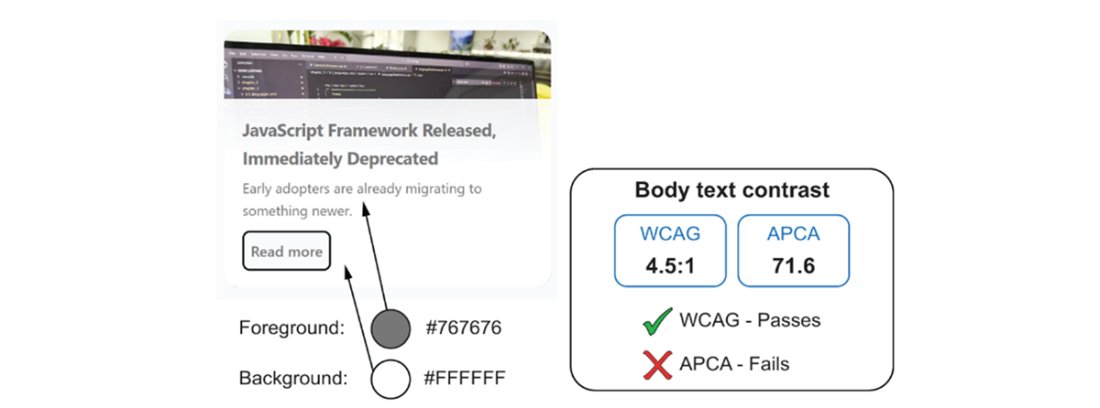
The same color pairing reaches a WCAG ratio of 4.5:1 but scores 71.6 under APCA, below the illustrated APCA body-text target of 75. The comparison shows why a passing ratio need not settle every readability question; APCA is not a normative web accessibility standard. section 3.1.1