Color psychology examines how colors shape feelings, associations, perceptions, and behavior. In product design, color helps communicate a product’s mood and message, but personal and cultural relationships influence how people interpret it. section 9.3 section 9.0
Color choices affect how people perceive an interface or logo before they consider its meaning. Clashing or uncomfortable combinations can suggest unprofessionalism and distract from the intended message. section 9.3
Common associations provide starting points, not universal rules:
- Red attracts attention and can suggest strength, power, danger, love, or passion. section 9.3
- Orange draws attention and can suggest creativity, amusement, adventure, energy, activity, warning, or danger. section 9.3
- Yellow is highly visible, draws focus, and can suggest caution, warning, positivity, optimism, amusement, or happiness. section 9.3
Attention and product mood
A bright red stop sign catches attention at an intersection, just as a red object can stand out more strongly than a black one. In an interface or logo, that visibility can support emphasis, while the broader color scheme still needs to fit the intended mood and remain comfortable to view. section 9.3
Figure 9.1 Adelson’s checker-shadow is an optical illusion where squares A and B are the same color. (Source: Edward H. Adelson. Licensed under CC BY-SA 4.0)
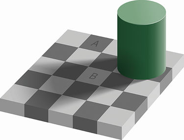
Use the checker-shadow illusion to observe how surrounding structure can change perceived color: squares that appear different are actually the same color. section 9.0