A component is a reusable interface unit that combines visual treatment with an interaction or content pattern. Reusing components creates consistency for users and gives developers a scalable library for building pages. section 2.1.3
Treat components as both a design and implementation decision:
- Repeat related styles, such as typography, color, shapes, and controls, so users can recognize patterns and navigate with less cognitive effort. section 2.1.3
- Build a shared component library instead of recreating each page, reducing unique code and making later pages easier to add. section 2.1.3
- Create only the components the project needs when possible; a smaller, understandable system is easier to maintain, iterate, and keep independent of a third-party ecosystem. section 1.1.4
Repeated listing patterns
A hotel-listing page becomes easier to scan when every listing uses the same headline, description, controls, and visual treatment. Likewise, repeated orange Add to Bag buttons communicate the intended action consistently across products. section 2.1.3
Figure 2.27 The page instantly feels more readable and scannable when styles and components are repeated in the same manner for each hotel listing.
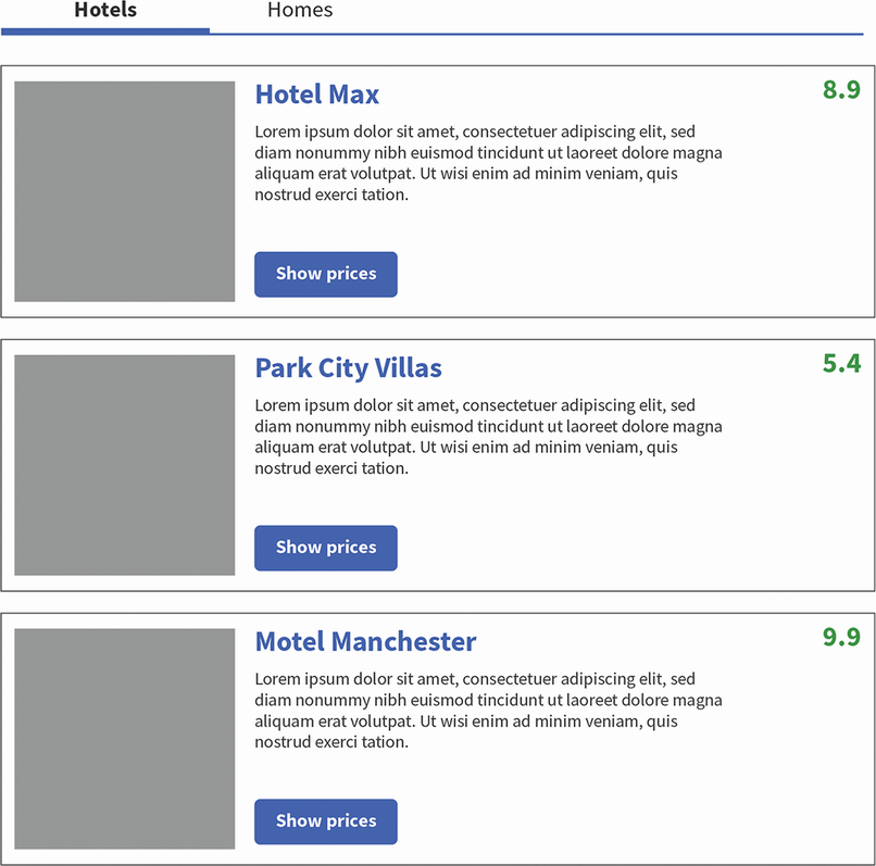
Shows how repeating styles and components makes a page more readable and scannable. section 2.1.3