Contrast (minimum) is WCAG’s Level AA rule for keeping text and visualization elements visibly distinct from their backgrounds. Regular text needs a 4.5:1 contrast ratio; large-scale text and visualization elements need at least 3:1. section 4.4.2
The goal is perceptibility: color should not quietly disappear into its surroundings. A border can rescue an otherwise weak design, especially when a chart mark needs to stand out. section 4.4.2
A border that changes the result
Blue bars on a light-gray background measure only 1.93:1 and fail the 3:1 requirement. Adding a dark-gray border raises the measured contrast to 8.7:1, comfortably passing AA. section 4.4.2
Figure 4.34 On the left, the blue bars have no border, so the contrast is calculated between the blue and the light gray as 1.93:1, which is too low to pass WCAG’s AA level of 3:1. However, if you add a dark-gray border, the contrast is then calculated using the border against the background, which shows up better than just the plain blue bars. The contrast between the darker gray border and the lighter gray background is a whopping 8.7:1, beating out the AA level by almost a factor of two.
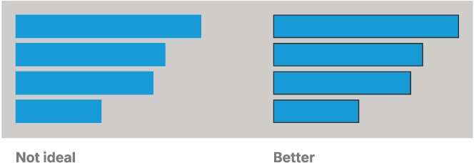
Compare the unbordered and bordered blue bars to see how an edge can improve contrast against the background. section 4.4.2
