A script typeface is a typeface classification shaped to resemble cursive handwriting or calligraphic lettering. Its handwritten appearance can give a design a personal, welcoming, or whimsical tone, making it especially suitable when a website needs warmth rather than strict formality. section 8.1.2 section 8.2.6
Choose and use a script typeface by connecting its visual character to the interface goal:
- Match the script’s mood to the message. Traditional cursive can feel personal, while broad brush-like strokes can feel modern and playful. section 8.1.2
- Use contrast to create hierarchy. Pair a script with a sans serif or serif, and make sure the two typefaces support the same overall tone. section 8.2.2 section 8.3
- Reserve script for appropriate text roles, such as headings or section titles, when its distinctive lettering would strengthen the design without competing with the main content. section 8.2.2 section 8.3
- Check readability before release. Test spacing and line presentation with users or other people when the lettering feels difficult to judge. section 8.2.6 section 8.3
A playful website pairing
A website with a lighthearted, personal feel could pair the playful script Pacifico with the rounded sans serif Red Hat Display. The contrasting letter shapes create hierarchy, while the rounded sans serif supports the script’s friendly tone. Replacing it with a narrower, more formal sans serif would make the combination feel stiffer. section 8.2.2
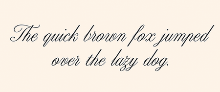
Compare a traditional script’s cursive appearance with other lettering styles when evaluating whether a handwritten effect suits the interface. section 8.1.2
Figure 8.6 A script with a more modern, playful feel with big strokes resembling thick brush strokes
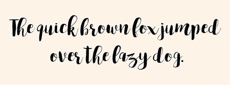
Inspect how large brush-like strokes give a script a more modern and playful character. section 8.1.2