A focus indicator shows which link, button, or form field currently has keyboard focus. Without one, a person moving through a page with Tab may not know what will respond to Enter, Space, or typed text. For someone who has lost their place, even a faint outline can turn a routine task into a search through the page. A useful indicator answers “Where am I?” immediately. section 5.3.1
Start with the browser’s default focus styling. Do not remove it merely to achieve a cleaner look: `:focus { outline: none; }` removes a vital cue unless an equally clear replacement is provided. Check the result on links, buttons, and fields, not just one component. section 5.3.1 section 5.6
Make a custom indicator easy to find
A custom style can combine an inner outline with an outer ring: `*:focus-visible { outline: 3px solid #F9F9F9; outline-offset: 0; box-shadow: 0 0 0 5px #193146; }`. The two colors help the focus state stand out against different surroundings. Test the complete indicator against the component and its background; a border that contrasts with a button’s fill may still disappear against the page. section 5.4 section 3.1.3
Figure 3.7 This image shows three examples of a focus indicator on a button component. The first indicator shows an external black focus indicator that has sufficient contrast against the white background. The second example shows a border focus indicator that has sufficient contrast with the button’s fill color but lacks sufficient contrast against the white background. The third example shows an internal focus indicator that provides sufficient contrast with the button’s fill color, making the focus state clearly visible.
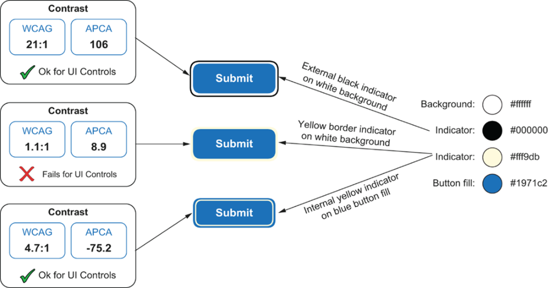
Compare the three button treatments: an external indicator visible against the page, a border that blends into the page, and an internal indicator visible against the button fill. section 3.1.3
Visibility also depends on where focus lands. A sticky cookie banner can cover a focused control even when its indicator has good contrast. Test keyboard navigation with fixed page elements in place; where a bottom banner overlaps content, `scroll-padding-bottom` can reserve space when the page scrolls to focused elements. section 5.3.1 section 5.3
Keep focus order predictable as well as visible. Tab through the interface and ask: Can I always tell where I am, including when I reach a link or move through a form? An enhanced form indicator helps people continue without losing their place. section 5.6 section 6.1.10
