A font style is a visual variation within a typeface family. Styles range from italic and oblique forms to thin, regular, and bold weights, helping typography emphasize words and establish hierarchy. section 8.1 section 8.1.3
Choose a font style according to both visual intent and semantic meaning:
- Use italic when its cursive letterforms support the desired emphasis or presentation. section 8.1.3
- Use oblique when a typeface should be slanted without changing the underlying letter design. section 8.1.3
- Use <em> for emphasized meaning, <i> for an alternate voice or distinct text, and a CSS class for purely visual italics. section 8.1.3
- Use contrasting weights and styles to separate headings from body copy, while keeping similar pages visually consistent through a type ramp. section 8.2.2 section 8.2.3
Contrasting styles in a web interface
A heading in extra-bold 800 paired with body text in regular 400 creates clearer hierarchy than two nearly identical weights. A page can then reserve italic or oblique styling for emphasis or an alternate voice. section 8.2.2 section 8.1.3
Figure 8.10 Italics aren’t just slanted; they have design elements added that make the slant feel more cursive and natural.
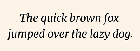
Compare true italics with oblique styling: italics add design changes that make the slant feel more cursive, while oblique simply slants the original forms. section 8.1.3