A printed page is built from many small filled shapes: one for each letter, number, punctuation mark, or other symbol. A glyph is one of those shapes in a typeface. This simple idea quickly becomes substantial work: one modern Palatino family includes 1,328 glyphs in each of its Roman, Italic, Bold, and Bold Italic faces. section 9.0
A glyph is more than its visible outline. It also carries metrics—numbers that help place it beside other glyphs. The baseline gives its vertical reference, like a ruled line for handwriting; the advancement says how far right to move before placing the next glyph. Since an i and a w occupy different widths, their advancements differ. section 9.2
Making “AV” look right
Putting glyphs in a line is not always a matter of using each advancement unchanged. A capital V after a capital A can leave an awkward gap. Kerning adjusts the space for a particular pair; Palatino includes rules that add or remove space, especially where letters meet punctuation. The result is a more pleasing line without changing either glyph’s basic identity. section 9.2
A single typeface may need glyphs for much more than ordinary English letters:
- Accented letters, plus separate accent marks that can combine with other letters. section 9.1
- Lining and old-style numbers, which differ in height, baseline behavior, and descenders. section 9.1
- Ligatures, where two letters may be represented by one glyph for appearance or because they form a different letter or sound. section 9.1
- Small caps, currency symbols, punctuation, Cyrillic, and Modern Greek characters. section 9.1
Figure 9.8 Glyph metrics
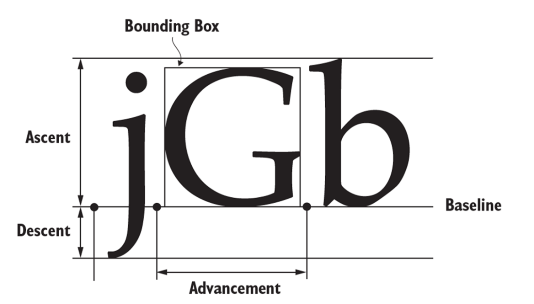
The metric diagram makes the invisible part of a glyph visible: its baseline, horizontal movement, and other measurements used to position it on a page. section 9.2
Glyph design can also change with size and style. Metal type commonly used distinct shapes for headlines, text, and footnotes because small forms need different proportions and ink spreads on paper. Computer scaling makes one design usable at many sizes, but some modern typefaces still provide separate optical sizes. Bold and italic faces likewise use shapes designed to work together, rather than merely being the same outlines in a new setting. section 9.3
A glyph, then, is both a drawn form and a carefully measured piece of page-making. Its outline, position, neighboring glyphs, size, and available alternatives all help turn selected characters into readable words and lines. section 9.5