A holy-grail layout is a content page pattern with a header, navigation bar, main column, sidebar, and footer. It keeps the main content central and the footer at the bottom, with common variations for column count and footer placement. section 11.1 section 12.17
It is used for blog posts, articles, essays, how-tos, and similar content-focused pages. The layout is a teaching pattern for comparing page layout methods. section 11.1 section 11.13 section 12.11
Common ways to build it include:
- Using float to place the header logo and title, navigation items, and content columns side by side. section 11.13
- Using display: inline-block for the same side-by-side pieces, with inline blocks flowing left to right by default. section 11.23
- Using flexbox with a vertical body container, horizontal flex containers for rows, and flex-grow to make the main area fill empty vertical space. section 12.11 section 12.17
Flexible footer behavior
In a flexbox version, setting the body to a vertical flex container, giving it min-height: 100vh, and setting main to flex-grow: 1 makes the footer sit at the bottom of the browser window. section 12.11 section 12.17
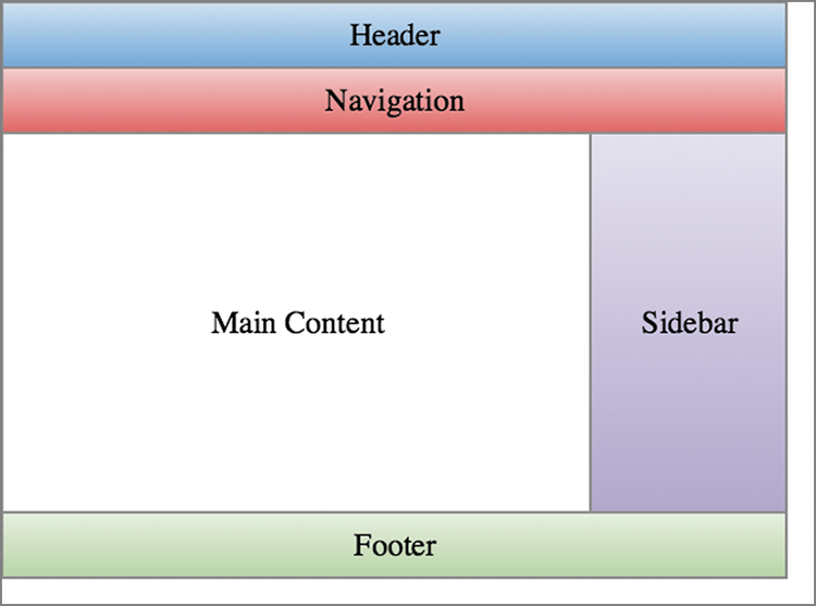
A schematic figure showing one version of the layout helps connect the named parts to the page structure. section 11.1