Reflow keeps content readable and usable when people zoom in, enlarge text, or use a narrow screen. Text should wrap rather than force horizontal scrolling, and no content or functionality should be cut off. section 4.4.2
Test a narrow or magnified view
Use browser developer tools to check a 1280px-wide screen at 400% zoom or a 320px viewport without zoom. Vertical scrolling is expected; horizontal scrolling should generally be unnecessary. Complex tables, maps, and timelines may need it, but contain scrolling within that element and keep its scrollbar visible. section 4.4.2
Check that text and controls remain visible when spacing changes, too. Fixed dimensions, hidden overflow, and disabled wrapping can cut off content or functionality. section 4.4.3
Figure 4.6 This image shows content that reflows in a single direction, rendered at 200% page zoom within a 1280-pixel-wide viewport.
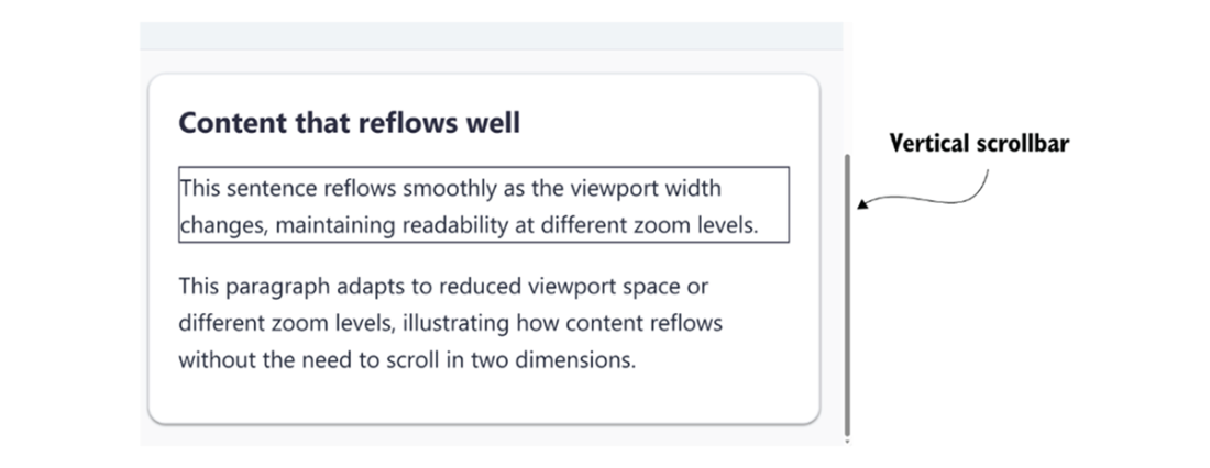
Shows content reflowing in a single direction at increased zoom. section 4.4.2