Text can be hard to read when its color is too close to the background, particularly for someone with reduced vision. Relative luminance helps measure that difference. In WCAG contrast calculations, each foreground and background color is converted from sRGB to a value that accounts for the eye’s differing sensitivity to red, green, and blue. section 3.1.1
The two values produce a contrast ratio: 1:1 means no contrast, while black on white reaches the maximum, 21:1. The practical question is whether the chosen text and background are far enough apart in relative luminance to remain readable. section 3.1.1
WCAG Level AA sets different minimum ratios according to what must be seen:
- Normal text: 4.5:1. section 3.1.1
- Large text: 3:1. This includes text at least 18 points, or at least 14 points when bold. section 3.1.1
- UI components: 3:1. section 3.5
TIP: Check the colors as a foreground–background pair; a luminance value alone does not tell you whether their contrast is sufficient. NOTE: A passing WCAG ratio need not be the best design choice. APCA offers supplementary, perception-focused guidance, but does not replace the governing WCAG standard for conformance. section 3.1.1 section 3.5
Figure 3.2 Example of contrast calculation using both WCAG contrast ratios and APCA. The WCAG contrast ratio (4.5:1) is sufficient, but according to APCA, the Lc score (71.6) is insufficient, as the contrast for body text should be at least 75.
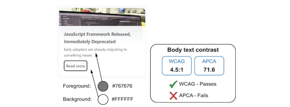
Compare a pair that meets WCAG’s 4.5:1 threshold with its APCA score of Lc 71.6, below the stated body-text target of 75. section 3.1.1