A triadic color scheme uses three colors evenly spaced around the color wheel. Because the relationship can feel intense, choose one color as primary and use the other two as accents. section 9.2.1
Use triadic colors deliberately in an interface:
- Apply the primary color broadly, the secondary color less often, and the third color as a minimal accent; the 60:30:10 rule offers a practical balance. section 9.2.1
- Use shades and tints to reduce intensity or create additional contrast while preserving the palette’s relationship. section 9.2.1
- Check text contrast and pair color with icons or labels rather than using color alone to communicate information. section 9.9
A balanced triadic palette
Red, yellow, and blue form a straightforward triadic scheme. Purple, orange, and green provide another example; one could lead the interface while the others support accents and secondary elements. section 9.2.1
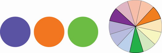
View purple, orange, and green arranged as a triadic color scheme. section 9.2.1