Text and interface elements need to stand out from their backgrounds. When contrast is weak, people with low vision may need to zoom, strain, or skip the content; bright light and small screens can make it harder to see. section 3.1
Small, thin text
The gray #6D6E70 can lack strong contrast when paired with small text and a thin font. Make decorative fonts more readable by increasing size and weight, and check the contrast. section 4.3
Figure 3.1 An alert with insufficient contrast. Text with insufficient contrast can lead people to miss it entirely or struggle to make sense of it. This becomes particularly hard in direct sunlight or on smaller devices.
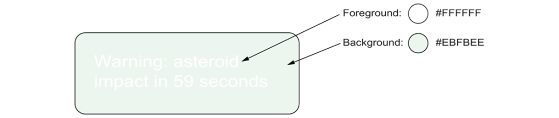
This low-contrast alert illustrates how text can be missed or become difficult to understand, especially in direct sunlight or on a small device. section 3.1