A grid is a network of intersecting lines that creates rectangular or square cells. In CSS, it organizes layout through columns and rows, giving elements deliberate positions without using tables for page structure. section 2.1
Use CSS Grid to:
- Create columns and rows, then place HTML elements within the resulting structure. section 2.1
- Build layouts that adapt to different conditions when combined with media queries. section 2.1
- Give an inner container defined rows such as min-content, auto, and min-content, allowing the middle content to take remaining space. section 5.4.2
- Keep layout semantics separate from tabular data: use grids for layouts and tables for spreadsheet-like data. section 2.1
From sonnet page to aligned cards
A sonnet page can use a grid to arrange its header, article, and sidebar content. A summary card can use display: grid with grid-template-rows: min-content auto min-content; the heading and link occupy only the space they need, while the paragraph receives the remainder and can be vertically centered with align-items: center. section 2.1 section 5.4.2
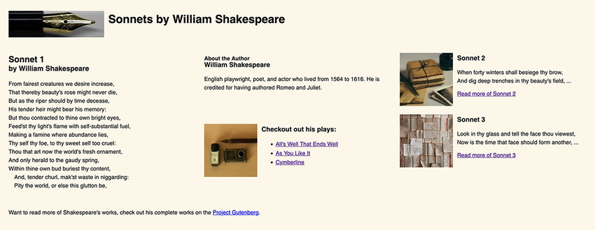
View the finished sonnet layout as a visual target for arranging the header, article, and supporting content with CSS Grid. section 2.1