A notification claims there are “important updates,” prompting a user to open an app and be counted as active. Deliberate design choices that steer people toward decisions benefiting a platform more than its users are called dark patterns. section 9.2.2
Figure 9.1 An example of how the same question, whether personalization should be turned on or not, can be framed in different ways. Option A implies that turning on personalization will give users the best experience—thus already nudging them in that direction. Furthermore, the Yes option is larger, and the different color makes it look like the natural choice for the user. Option B, on the other hand, is more neutral, asking users a less loaded question, and providing equal visual weight to the choices, with Yes still being on top. Option C is the most friendly to users: the two choices are given as equal visual weight as possible, and the tradeoffs to consumers are briefly explained. Platforms will always prefer Option A, as it best serves their interests, while users would be better served by Option C. Option A can be considered a dark pattern, as it nudges users towards something that is advantageous for the platform, but not so much for them.
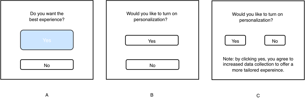
Compare three ways to ask about personalization: loaded wording and a prominent Yes button steer users toward the platform’s preference; neutral wording and balanced choices make the tradeoffs clearer. section 9.2.2
Defaults can also favor platforms: social feeds commonly default to algorithmic recommendations. Regulatory efforts seek to limit dark patterns in consumer applications. section 9.2.2