liveBook · Manning

Bar chart

As explained in Coding with AI

A bar chart is a data visualization that represents values with rectangular bars whose lengths correspond to those values.

A bar chart displays values as rectangular bars, making word frequencies easy to compare. A Matplotlib function can plot the most frequent words from processed text. section 2.5.3

Plot the top 20 words

Sort a word-count dictionary by frequency, select the top n entries, and draw bars with word labels, rotated tick marks, axis labels, and a title. Running the program displays the top 20 words from a text file.
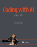

How Coding with AI covers it

How deep it goes
Demonstrates sorting counts, selecting top entries, labeling axes, rotating ticks, and displaying the graph, without deeper visualization theory.
Examples
Plots the top 20 words counted from a downloaded text file.
What it assumes
Assumes text processing has produced word counts and requires installing and importing Matplotlib.
What you can do after
Apply it via Matplotlib to visualize ranked frequency data in a runnable Python program.
How it connects
Connects bar charts with word frequency, dictionaries, text processing, Python functions, and Matplotlib.

Also explained in

Compare how 9 books explain bar chart →

Related concepts

This explainer was generated by Manning's knowledge graph from the text of Coding with AI. The section links point to the parts of the book it draws on.